Beginners Mixed Media: Mesmerizing Marble!
After over a year now of both digital mixed media experimentation here on the blog and looking at home renovation inspiration images and samples for tiles and benchtops in real life, today I’m bringing in the marbled look to my digi layout. (Inspiration is everywhere, right?!). Marbling is a fun technique to create your own paper and paper -based elements in paper crafting.
I remember making ‘marbled prints’ for art when I was in school, using a container full of water with some oily drops of coloured dye or ink floating on the surface, mix with a toothpick to create a swirled pattern and then lay some thick plain white paper over the top to absorb the marble magic, and voila! (You can also apparently use shaving cream, milk or other substances to hold your coloured pigments of varying kinds (Google has lots of how-to links) and the marbled effect is fun surprise every time).
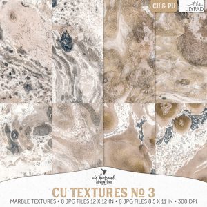
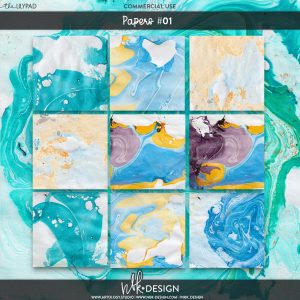
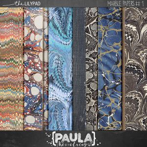
In interior design, unique veining patterns in high-end marble benchtops like the renowned Carrara Italian marble, can be streaked with gold and are both expensive and timeless elements that bring character and sophistication to a space. There are various kinds and various colours available and for digiscrapping, some CU marbled patterns and styles are available in the store (as well as online tutorials for creating them from scratch with the ‘render> clouds’ and ‘liquify filters’ in Photoshop) if you want to create your own marble in specific colours but there are some ready-to-go marbled paper packs as well.
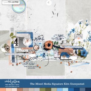
I haven’t been actually scrapping much this year so despite the best of intentions I missed last month’s TLP template challenge, with the lovely Rachel Jefferies’ template, but I had photos in mind and so I’m just going to run with it – better late than never, right?! – and I knew I would be using some of Rachel’s fab mixed media with it so I grabbed this Unexpected kit from her signature series to use with the template before I even thought about marble, the colours and florals in the kit suited the photos I planned to scrap.
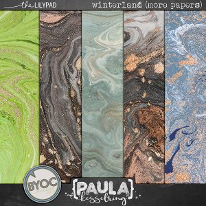
Getting started: So whenever I start with a template with a large amount of negative space, my instinct is to fill it with pattern or texture (or more photos) and the marble paper I’m starting with can fall under both those categories. I’ve pulled the predominantly blue marble paper from Paula Kesselring’s Winterland (More Papers) pack.
Here’s my starting point, you can see how just using a marbled background with a template can create a very detailed and engaging page very quickly.
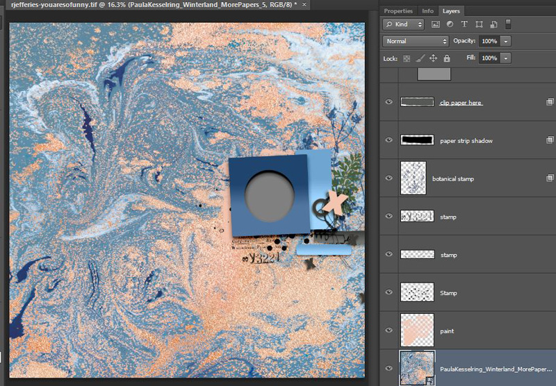
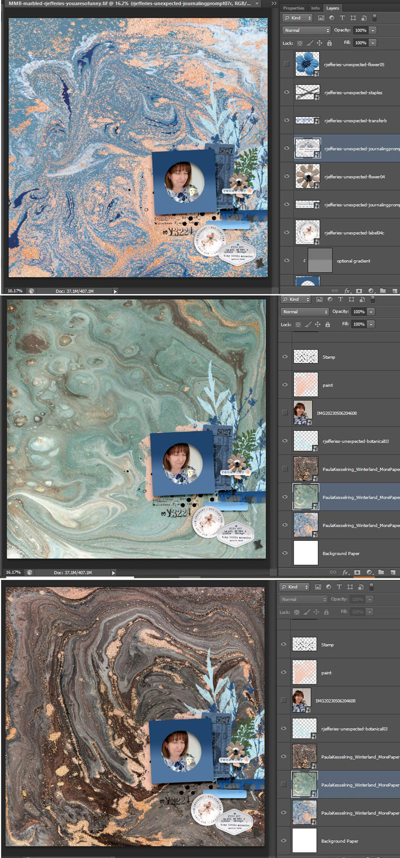
So then I brought in a photo and a few elements, and because I was feeling indecisive, and wondering if the page was ‘too blue’, I tried a few different marbled backgrounds from the Winterland paper pack and walked away for a bit to think.
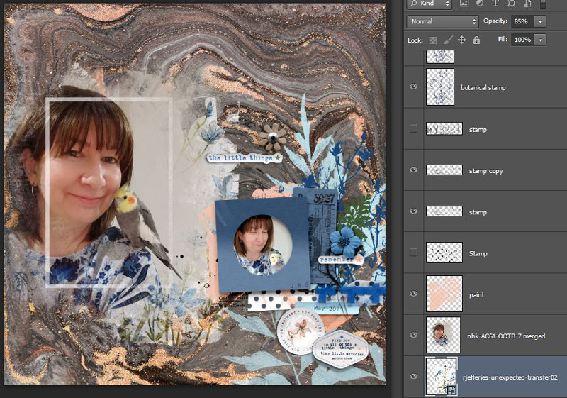
I came back and pulled in one of NBK’s Out of the Box Frames masks (artCrush#61 ),
(I’ve discussed masking on the blog in more detail here and here), this is a very cool and versatile product but I turned off the text layers before adding my photo and flattening it to drag it in from it’s own psd file, and added my extra photo in some of the negative space area of the template.
As much as I liked the masked extra photo, how it blended seamlessly into the background and that strong linear style frame among all the swirls and freeform shapes, it didn’t really help me decide on which background to use. I still liked them all and I know it’s a good problem to have, being spoilt for choice (and this is a bit how it felt initially while picking benchtops) but it also felt a bit frustrating, so I went back to the kit of Rachel’s that I started with, to throw more elements and mixed media onto the page and see if I could narrow down my options, (the blue floral transfer with the white paint background was part of the reason I picked this kit, so I had to use that), and what do you know! It actually helped.
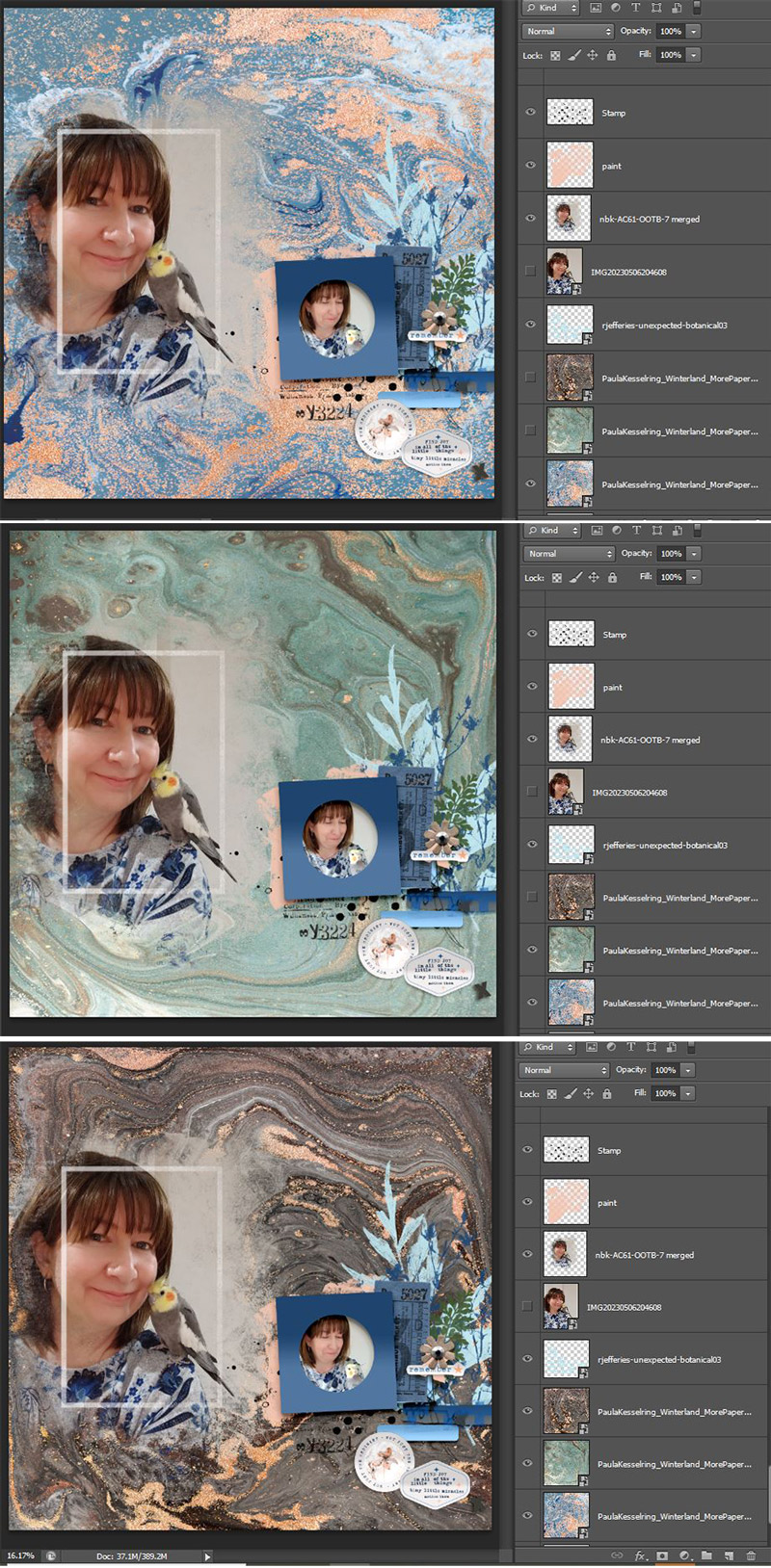
I ruled out the blue background I started with. And then at this stage, I started preferring the brown with the glittery gold/copper veining and the hints of grey in the swirls that went with the backdrop of my photo and George, the bird’s feathers …
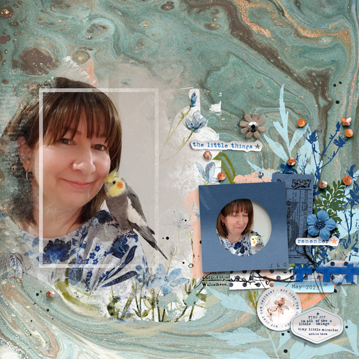
Final page: … but ultimately, the slightly less busy, aqua marbled background was the one I finished off with. I think the main reasoning was the blue bent frame and cluster from the original template just had a bit more weight and impact against the more subdued aqua. The veins of gold and brown and direction of the swirls really framed my clusters well and aided the visual flow of the page but I think the mostly brown paper did this almost equally well which made choosing difficult. Either way, the marble pattern was well suited to use with messy string & stitching and the orangey bead scatter in Rachel’s kit picked up on the warm tones in both the paper and my bird and added a bit of dimension along with the flower elements.
Featured marble on one of your pages? Link me up below! See you next time!