Thoughtful Thursday : So many words
Hello everyone. One of the very best things about scrapbooking to me is the pairing of photos and words. I know that some people struggle to write on their pages. I imagine that I am speaking over someone’s shoulder about the photos they’re looking at and then write down what I would have said. I find that when the kids look through the old albums, they linger over the stories. Also I use the opportunity to tell things from my perspective. I have perused the Pollywog gallery and want to highlight some word-rich layouts to inspire you.
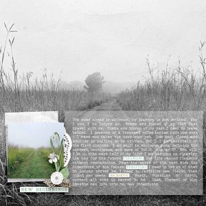
First up is ArmyGrl, She used the same photo twice, once as her background, making it black and white with a beautiful dreamy feeling, and then in colour as a detail shot. Then she layered some vellum to house her journaling. Adding a layer like this helps make the writing more legible. To add another pop of dimension and interest she added some wordstrips. Even though there is no title you’re drawn in to see why the photo holds meaning and what it conveys to her and for her. The Road Ahead by ArmyGrl
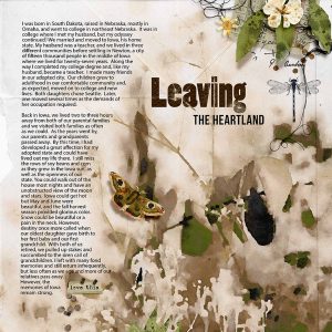
Iowan’s leaving the Heartland, is so poignant. She shares the reasons for their move, and ” the siren call of grandchildren” would be enough for me too. The title alludes to what the journaling will be about, the colours are evocative and a little yearning. I love the way the wording is left aligned and allow space for the scrapping elements, beautifully blended in there.
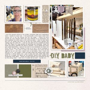
Karen’s Built Console Table page 1, uses more of a magazine style design, allowing space for the photos, small details and the story of her DIY project. I love that this is more step by step, more factual. I love the peek into the process that her words allow. This makes it much more interesting than the photos alone could possibly have been.
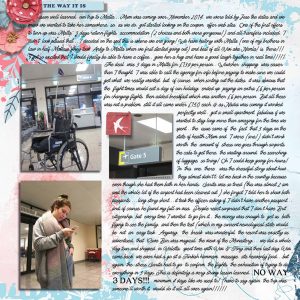
And lastly it’s MrsPeel’s The way it is. I love that she filled the background with her words. Sharing the details of her trip to Malta. She kept the design quite plain, mostly just the photos and the words. She kept the font large enough to be legible, but I have also used an illegible font and made it very small when I know that my words may offend or cause hurt to someone in the family that might read it down the line. A word strip suffices as a title and a few choice words in a different font that are larger add drama and contrast and make you want to see what caused the delay.