Are you primarily a one kit only scrapper, on a budget or looking for ways to extend your stash?
Mashing 2 (or 3!) kits together (and making your own customised collab!) gives you so many opportunities but means you won’t have to spend all your time tagging or searching your stash. If mixing and matching is not your normal style and feels daunting, this series will look at several ways to make mixing different design styles easier than you think!
______________________________________________________________________________________________
Hi there and welcome to a fun new way to start Mondays in the middle of the month – The Monday Mash-up!
definition: Mash-up
noun- informal.
* a combination or mixing of dissimilar elements, especially content from different sources.
I hope you are enjoying the mash-up series, so far we have mashed kits of different styles from different designers that have a theme in common, we mashed 2 kits with different themes by the same designer and very different kits with the colour blue in common.
This month we are mashing in monochrome! While monochrome can mean limiting your creation to any single colour family, black and white (with all the shades of grey inbetween) represents monochrome in the purest sense. I’m planning on taking the the black and white papers and pieces from 2 different themed kits and using them as the basis of my page.
Most scrapbookers know that a black and white photo, or photo treatment, can be your saviour if the kit that is perfect for your photo has a colour scheme that clashes with the colours in your photo. The reverse is also true!
Got a photo you love but the colours are overwhelming and finding a kit is hard?
Go for the ‘goes with anything’ combo of black and white or neutrals that are often the backbone of kits. If you are anything like me, you’ve been mixing and matching black, white and neutrals in your wardrobe for years so this will be easier than it sounds!
Today my photos aren’t actually in black and white but do look like it because of my photo subject but the page & story is really about grey! (The grey feathers in her crest she lost while moulting recently but it has returned!)
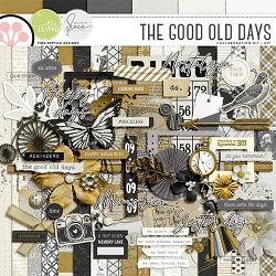
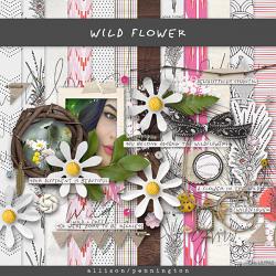
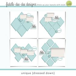
Just like it can make the details of a photo stand out without the distraction of colour, black and white in papers and elements makes the patterns and design the stars. These are the kits I’m mashing today. Both Designed by Soco & Pink Reptile Designs’s collab The Good Old Days and Allison Pennington’s Wild Flower have a strong black and white base and some lovely patterns among their papers, as well as some bird themed pieces in the elements that I know will work with my photos. I’m using a template too that has 2 photo spots and plenty of spots to feature lots of monochrome papers. It’s from Fiddle Dee Dee Design’s Unique {Dressed Down } templates but I’ve rotated the photo spots to portrait orientation to suit my photos and keep the diamond paper pieces nice and long rather than rotating the whole template and having wider diamonds.
- Mashing with black & white:
So here is my template, the one on the top left of the template preview, with my photos dropped in and some papers from both kits placed.
Then I started dragging in elements and continued to shuffle papers around.
This is a closer look at the paper patterns especially, the lace print in the background as well as the delicate flowers in the right diamond and the big mandala are all beautiful and all work well together because they’re in the same colour family. The different scales of the patterns from the huge mandala print to the tiny dotted chevron, including the smaller, delicate florals and medium sized lace which are somewhere in-between, also help them harmonise.
And here it is, finalised.
The additional sprinkle of gold tones, like those gold framed central diamonds that connect the top and bottom clusters, works here as a neutral but also extends the black and white colour scheme, adding interest and highlighting parts of the page like the wordart and the photos. Keeping the gold close to the focal points, those two clusters, also keeps the eye from wandering off the page. If I had more rich, colourful photos, the amount of gold I sprinkled in may have been too much, but black and white is a pretty reliable combination and I know a black and white mash-up will work great any time. Tag me if you have a go at a black and white mash-up yourself!