Froggy Finds – Alphabets 2
Hello, Froggy friends!
Happy weekend! Last week, I did a blog article on the amazing alphabets and alphabet sets in the TLP store. That article focused mostly on products released in the last year. This article digs back a bit into older products where there are some amazing alphas, as well as a treasure chest full of fonts! The final alphabet set I’m sharing is the #1 most-used alphabet set from my TLP stash.
Off we go!
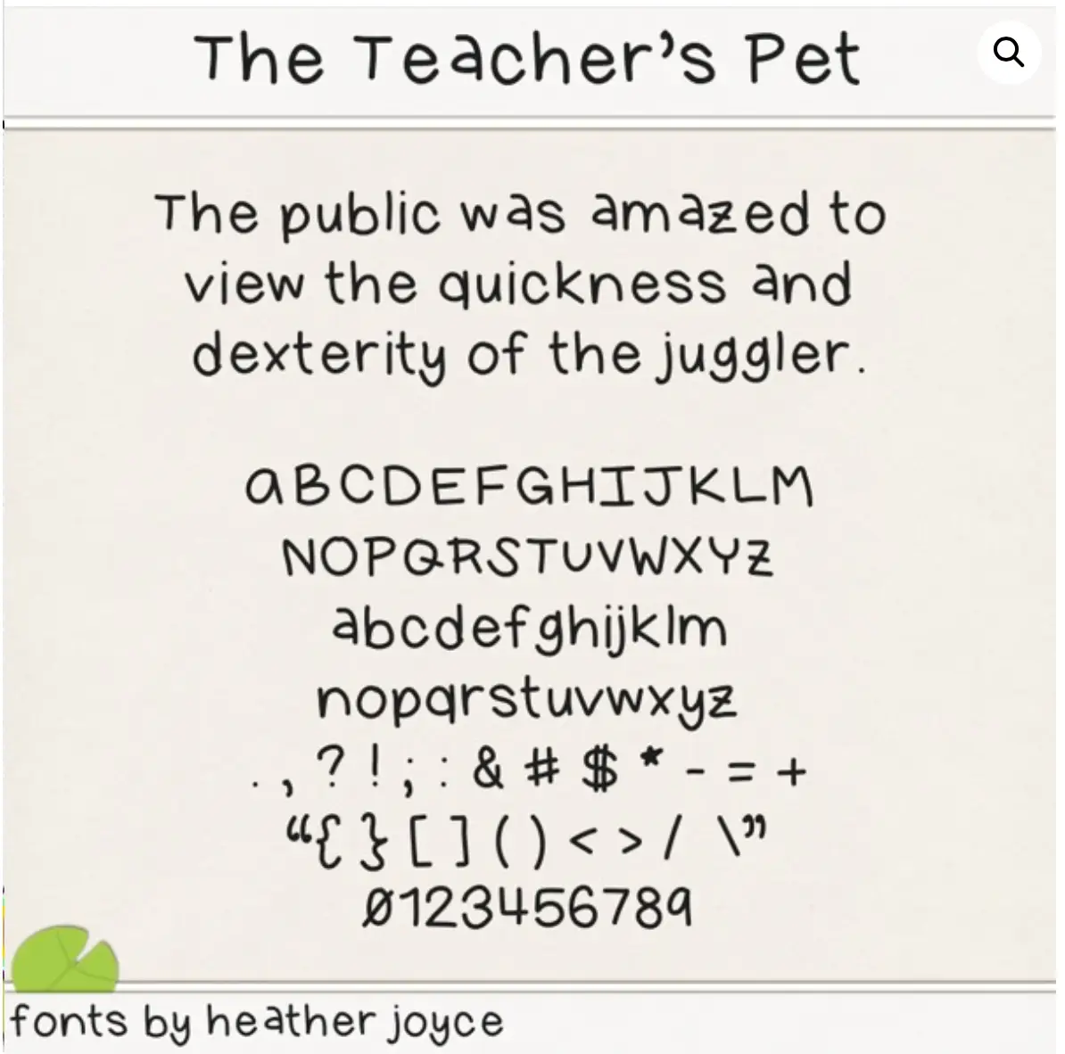
THE TEACHER’S PET, by Fonts By Heather Joyce
My first feature isn’t an alphabet set, it’s a font. Heather Joyce, who designs under the name, “Fonts by Heather,” has over 200 products in the TLP store and nearly half of them are fonts! I got her font, The Teacher’s Pet, and I love how legible it is. Our family is not blessed with good vision, so I need easy-to-read fonts. Heather’s fonts fit the bill. I’ve added several more of her fonts to my store wish list.
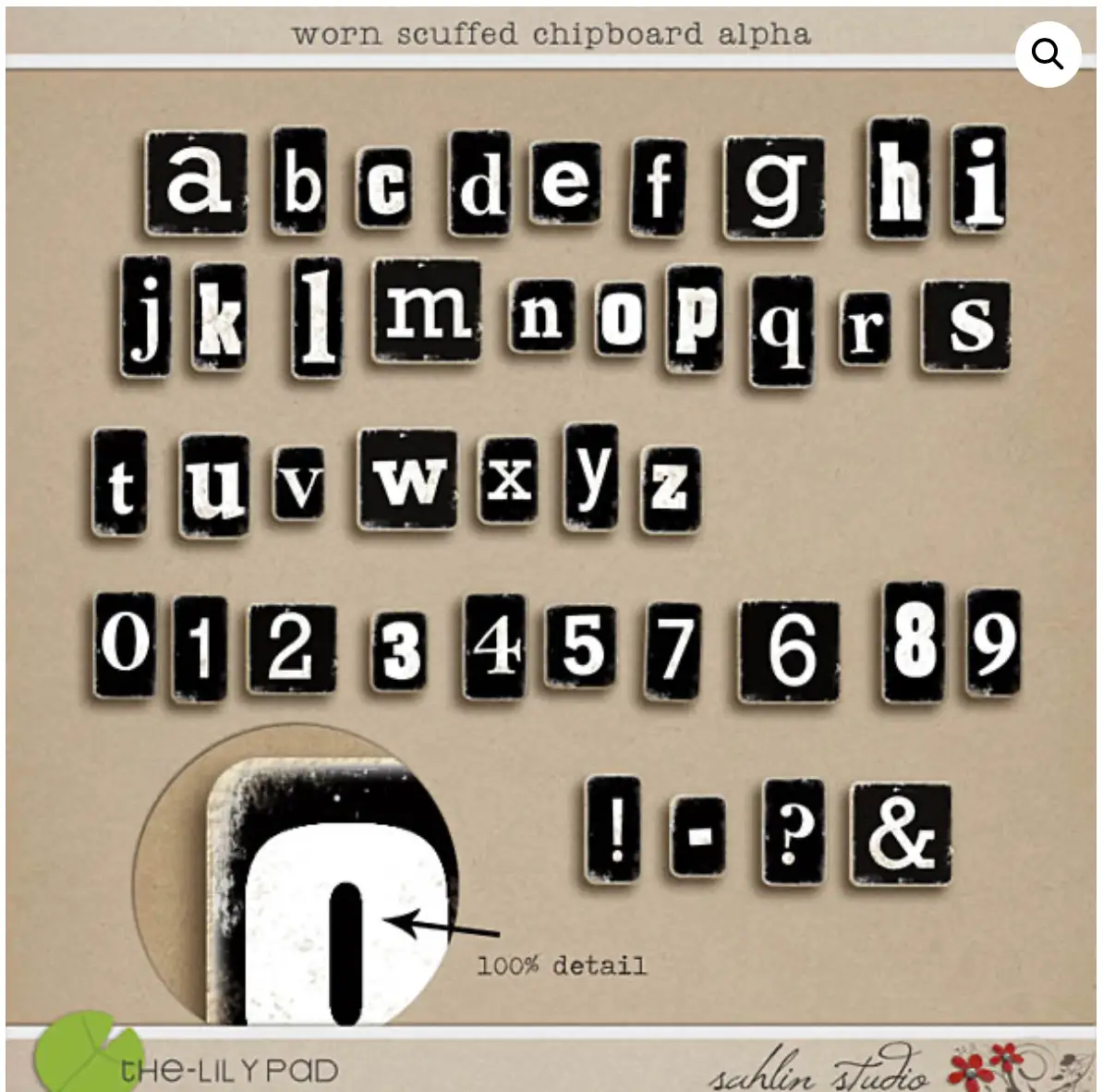
WORN SCUFFED CHIP BOARD, by Sahlin Studios
My scrapbooking hobby started out with paper layouts in the mid 1980’s when there were very few supplies available. This alphabet reminds me of the early 2000’s when the industry exploded and chipboard shapes were all the rage. I remember buying, painting and then hand-sanding the edges with fine grain sandpaper. Worn Scuffed Chipboard is whimsical, dimensional, eye-catching and bold, without the mess of paint and sanding.
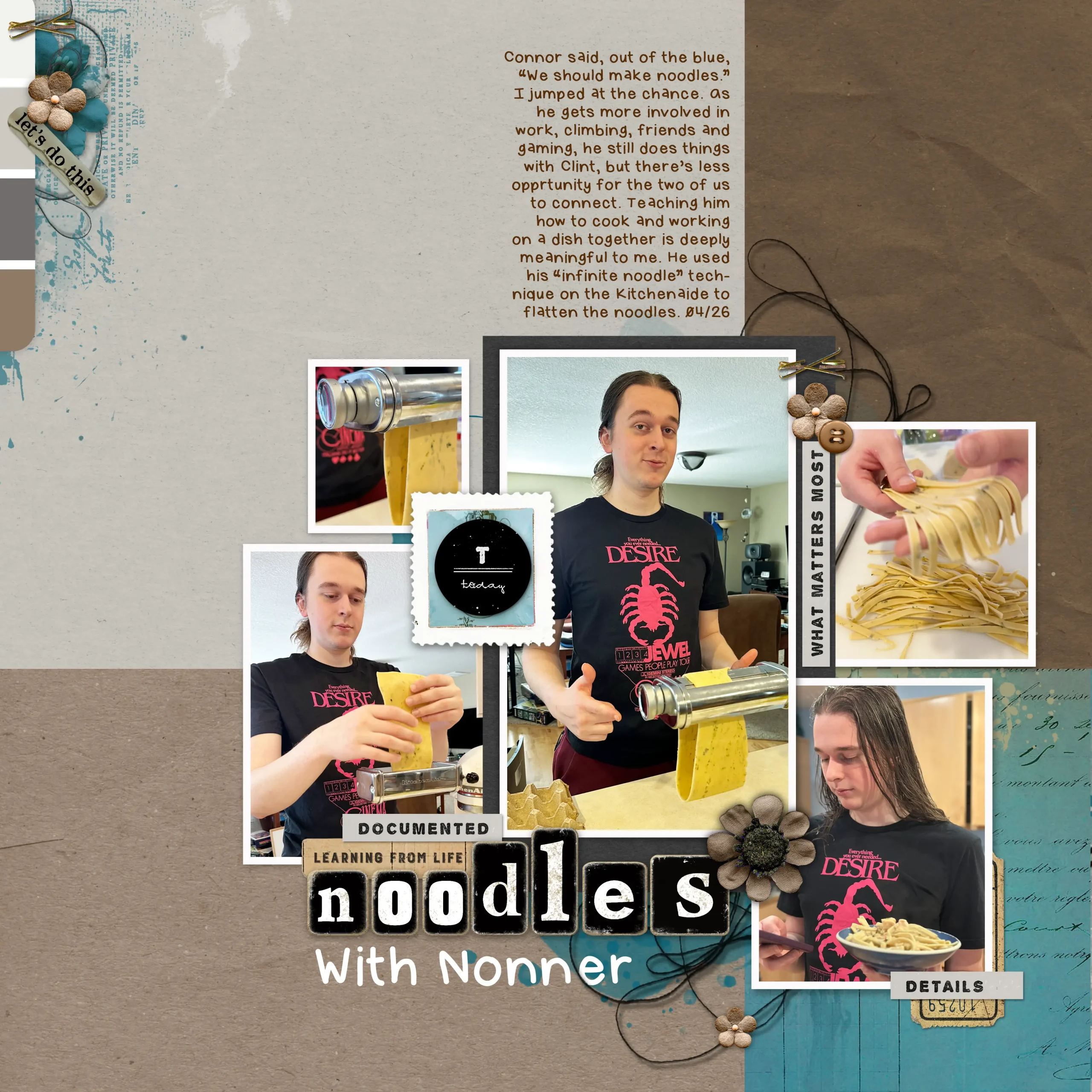
Here’s a layout I made that includes both The Teacher’s Pet font and Worn Scuffed Chip Board alphabet.
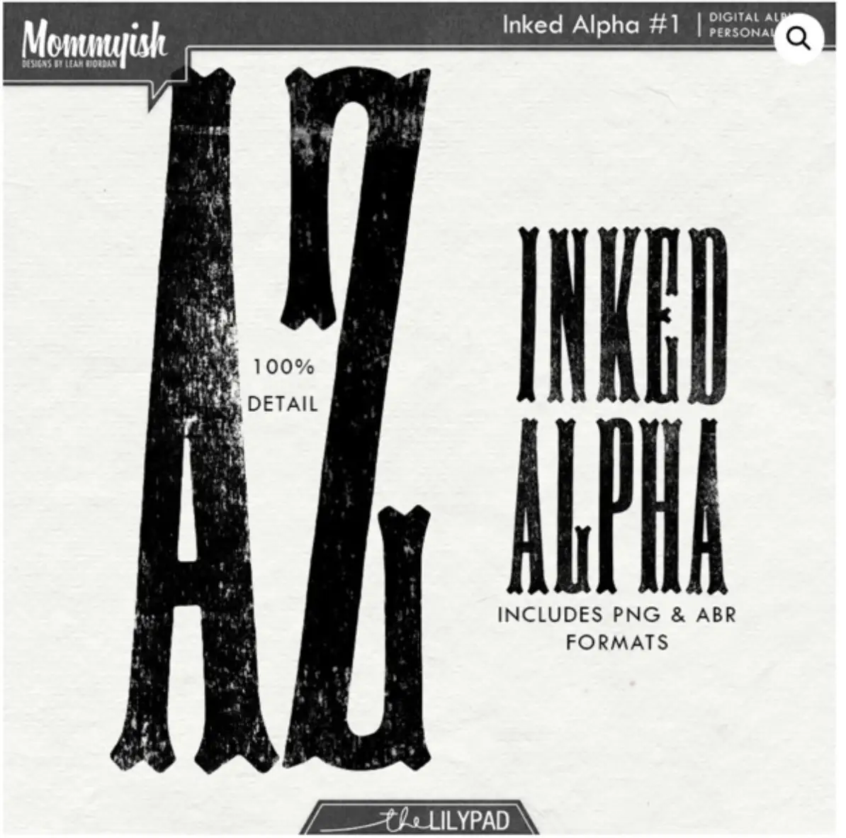
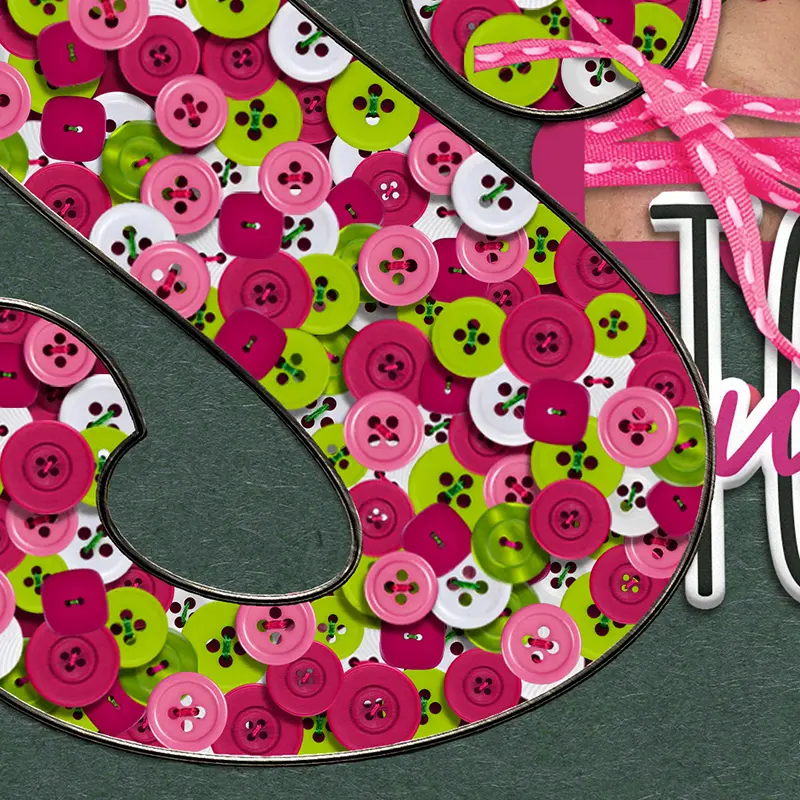
INKED ALPHA VOL 1, by Mommyish
Inked Alpha #1 reminds me of another traditional scrapbooking supply – foam alphabets and paint. Large titles take center stage on layouts in the best possible way, and we digital scrapbookers have the advantage of re-sizing, opacity, and color to make them coordinate well on the page. These letters would be great for a long title that needs to fit in a narrow space, tall items (people, giraffes, buildings), and emphatic titles.
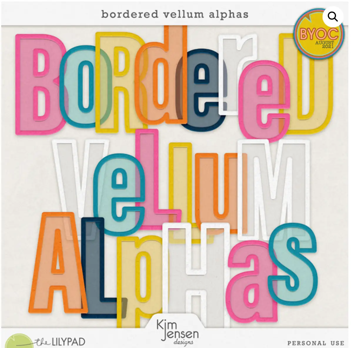
BORDERED VELLUM ALPHAS, by Kim Jensen
Here’s another alpha set with big letters, this one colored for a bright impact. I have to admit, I bought this set a few years ago for a Month of Challenges (MOC) layout where we needed to make a big title stretch across the page, and I’ve loved it ever since. I especially like using the yellow and white over the top of large photos of water. The alphas also read “youth” and “energy” to me, for a birthday layout, playtime, or early reading and writing. If you’re looking for additional fun colors, Kim has several more volumes of these alphas in her store.
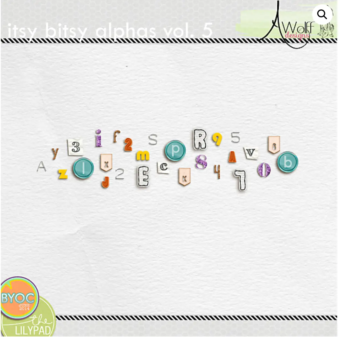
ITSY BITSY ALPHAS VOL. 5, by Amy Wolff
After showing three large alphas, let’s go small. Check out this adorable and budget-friendly set of small-sized alphabets by designer, Amy Wolff. There are nine totally different alphabets here in a variety of shapes, fonts, and colors. A few of the solid ones would re-color easily, adding to their versatility. These alphas could fit a long title or even a mini sentence of journaling. I also envision them on clean and simple layouts where are just a couple photos, a couple elements, and an itsy bitsy title.
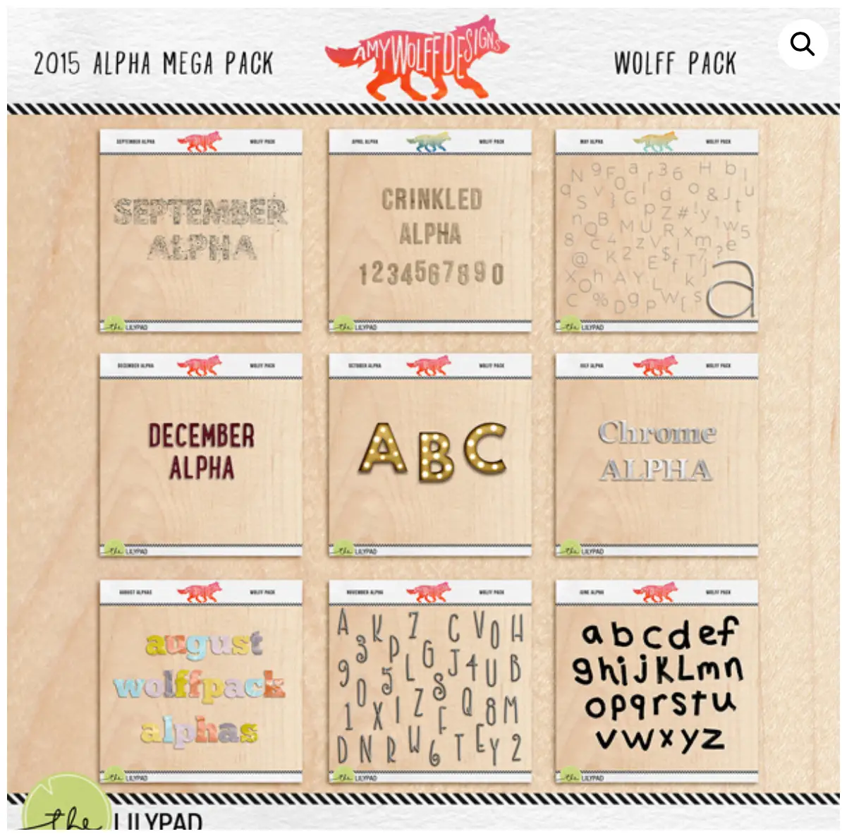
2015 MEGAPACK – Amy Wolff Designs
While I’m mentioning Amy’s tiny alphabets and what a great deal they are, here’s another one of her bargain packages. This is another package of nine alphas released in months of 2015. The one in the center looks like it belongs on a page about the theater, movies, someone dressing or acting fancy. Chrome is versatile, and there are upper and lower versions in the chrome set. The messy alphabet at the top left makes me want to do a layout about telling one of my kids to clean their room!
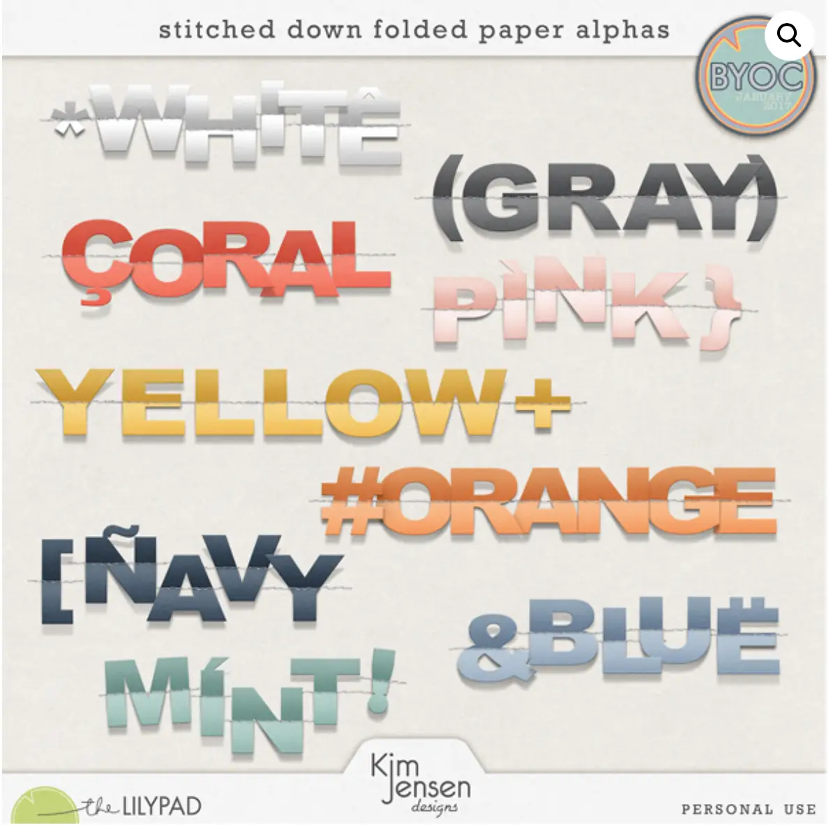
STITCHED DOWN FOLDED PAPER ALPHAS – Kim Jensen
Kim has such a breadth of alphabet sets in her store it’s hard to feature just one or two. This one, in particular, caught my eye with the center fold and stitches. Themes that come to mind for me are, “You Keep Me in Stitches,” “Holding on by a thread,” “Ties That Bind,” and “I Love You Sew Much.” The round and square brackets would be great if enlarged then used to frame a photo, journaling or key element.
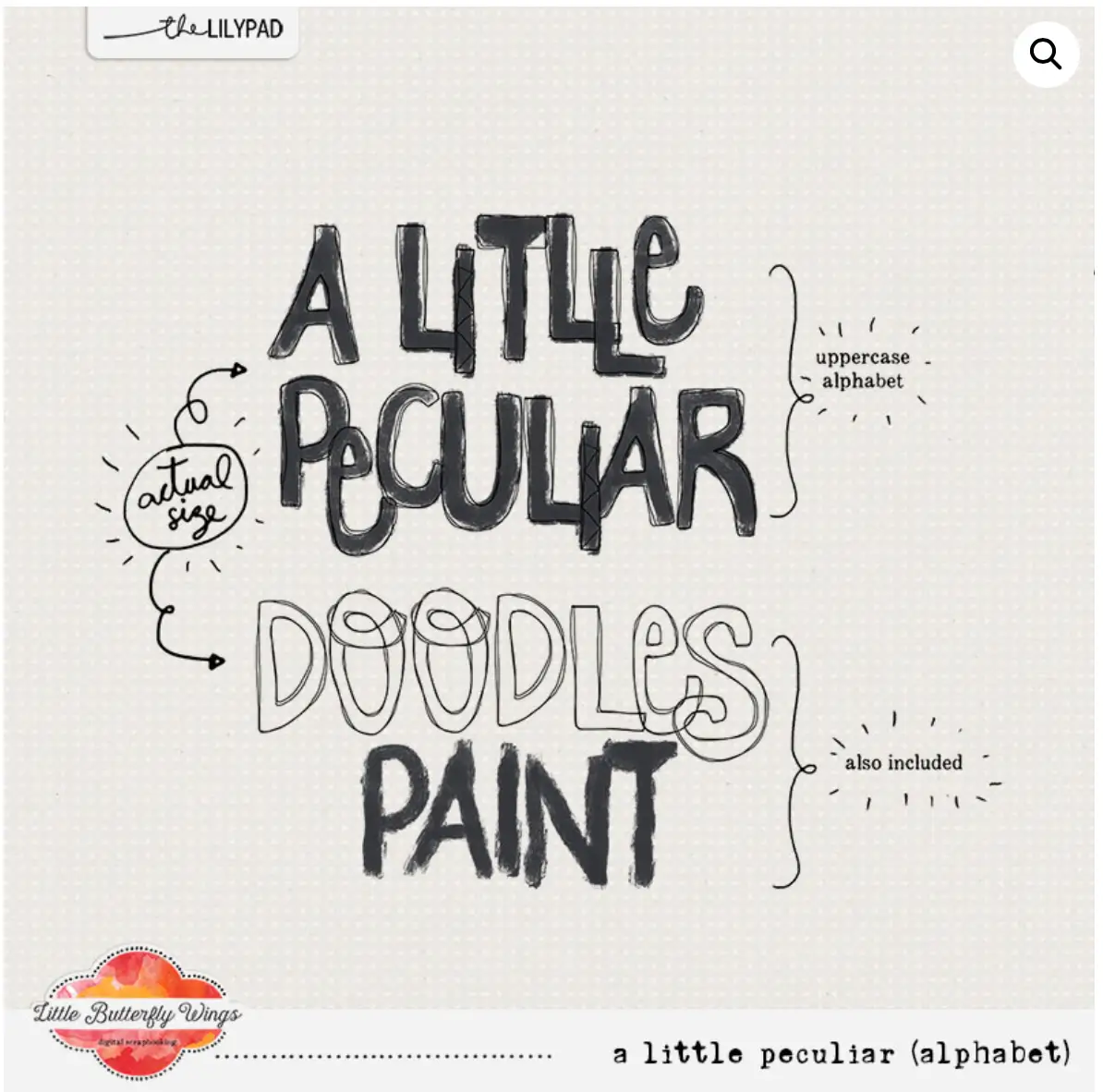
A LITTLE PECULIAR – Little Butterfly Wings
The name of this alphabet is perfect for the look of its lettering. Quirky and cool, “A Little Peculiar” would be terrific to document a person, couple, or group who are a little off-center. The paint version of the alpha would be fun for a paint or art night with a group of friends. It would also go well on a layout about my kittens, Mischief and Mayhem, going about their daily destruction. The paint version could be whimsical or spooky, depending on coloring and placement.
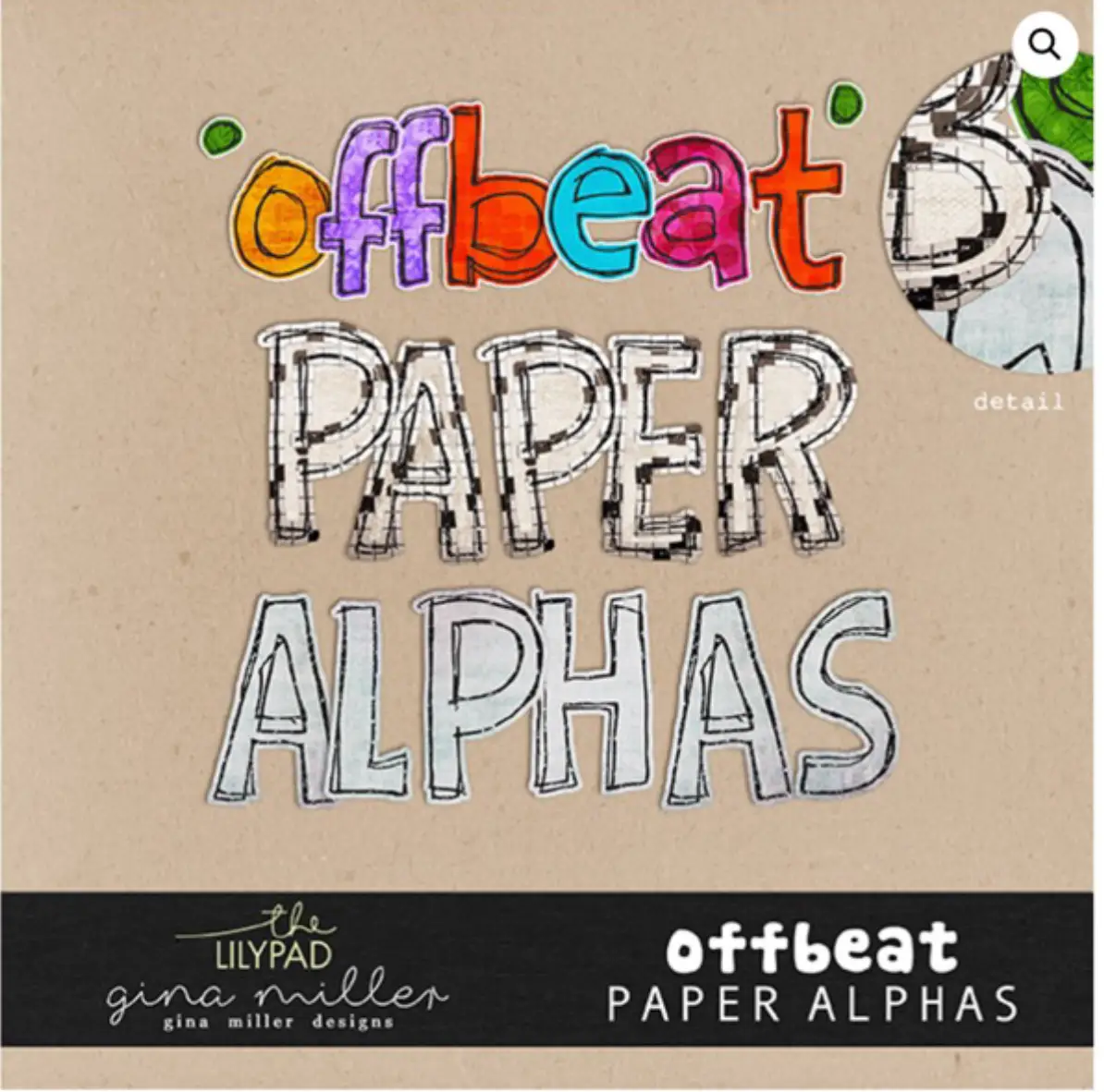
OFFBEAT PAPER ALPHAS – Gina Miller
The first thing my eyes go to with this set is the brightly-colored lowercase alpha at the top. The lettering screams kids, vacation, high-energy sports, fast cars, summer, shave ice and all things that are equally messy and joyous. Then, I notice the alpha at the bottom, filled in with pastel blue and lavender. This alpha speaks to me of fog over water, quiet moments with a young child, deep thoughts, and dreamy calm. If the top alpha is shaved ice, the bottom one is cotton candy. The middle alphabet jumps out at me for a layout about my husband’s penchant for crossword puzzles. It could also be used for layouts about school, homework, news or newspapers, and papercraft.
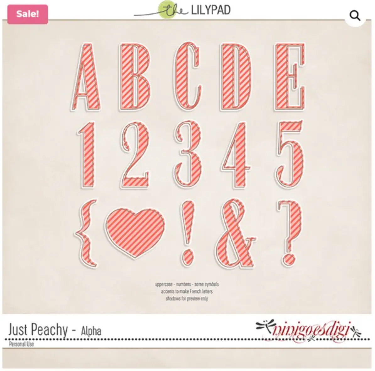
JUST PEACHY – Ninigoesdigi
This alphabet goes with all things Spring! Flowers, gardens, and enjoying nature the first days it’s warm enough to venture out without a down parka. The mix of light and dark peach with white makes the alpha look friendly and inviting, even a little playful. This would be cute on layouts about babies, special relationships among family / friends, Spring, Easter, and new beginnings.
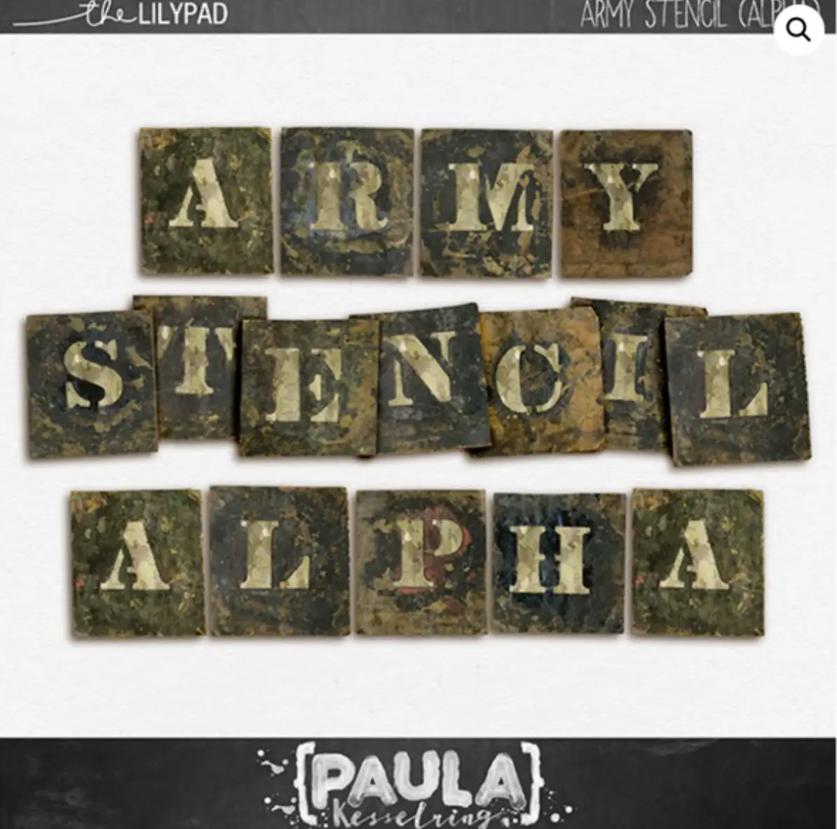
ARMY STENCIL ALPHA – Paula Kesselring
There are so many things to love about this alphabet! Grungy, messy, and textural, the obvious uses are for projects related to army, camouflage, masculine, hunting, and outdoor layouts. It also inspires me for use on layouts about home repair, old / rusty cars, country landscapes with barns, metal work, exploration, dinosaurs, and messy little boys.
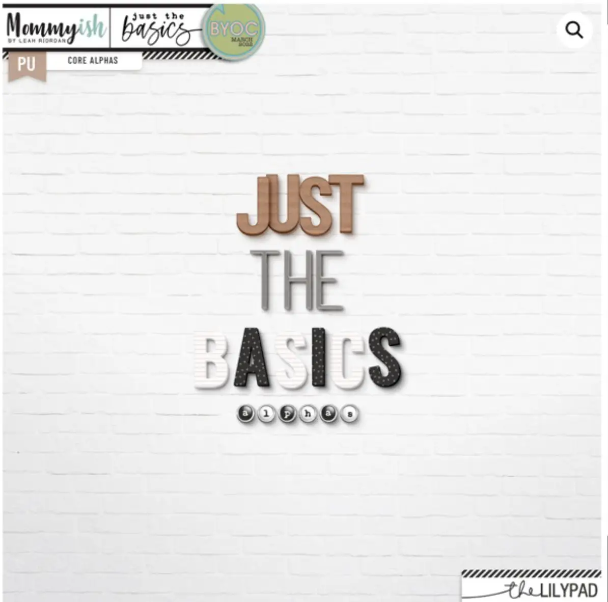
JUST THE BASICS – Mommyish
My final alphabet feature for this article is Just The Basics, by Mommyish. This is the little black dress of alphabet sets, with a mix of neutral colors that coordinate with any layout. It was love at first sight when I found it a few years ago, and it’s graced at least a dozen of my titles in recent years. I particularly love the tiny circles that remind me of the letters on my mom’s old typewriter. When I can’t find a theme-specific alphabet, this set is my go-to, goes-with-anything set.
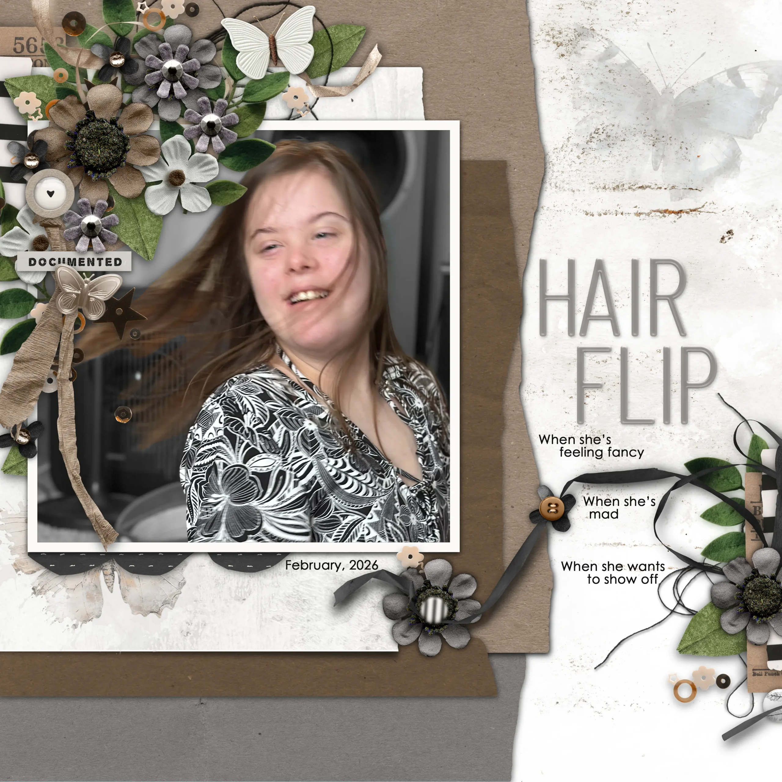
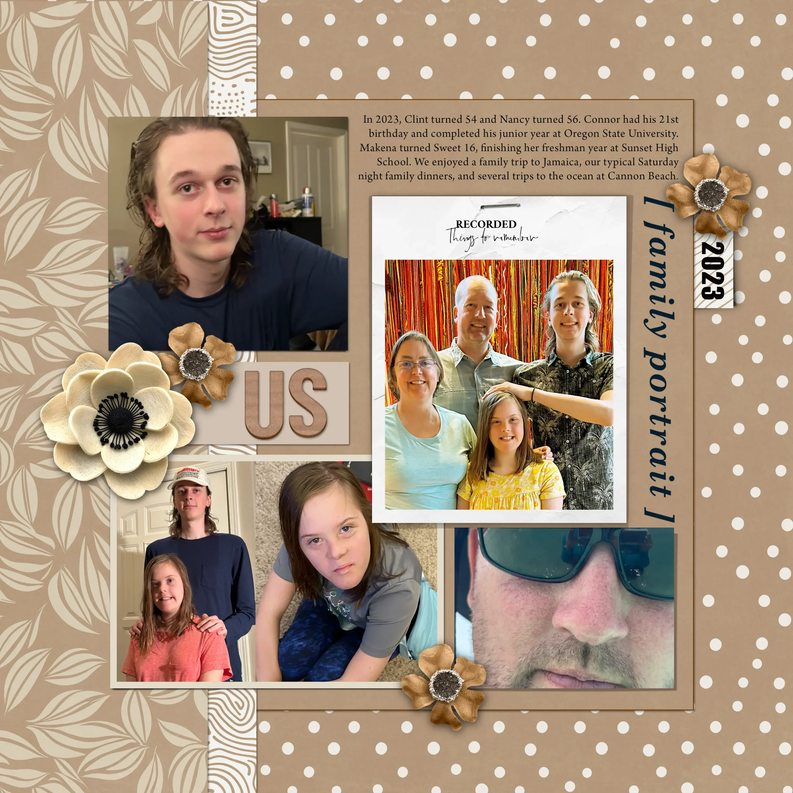
To close out this article, I’ll leave you with a few of my layouts using Just The Basics
I hope you’ve enjoyed this tour of the alphabet section of the store. Happy titling!
I was born and raised in the Pacific Northwest, currently residing in Oregon with my husband and 2 fledgling adult children. Although I’ve spent my life living within a 200 mile radius, i’ve been to 28 countries and am planning my visits to countries 29, 30 and 31 within the next year. I work in the fitness industry as a pilates instructor, personal trainer, and mentor to other instructors.
My creative style can be all over the map as I enjoy trying new styles. My default style is lots of photos with story-telling journalng. Reading family scrapbooks is what taught our daughter (special needs, Down Syndrome) how to read. She loves seeing pictures of herself, and I include lots of photos for her to highlight her activities with journaling to encourage her to read aloud. A lot of family history, vocabulary and education can be snuck into scrapbook pages!
I’m a HUGE fan of templates! About half the time, I’ll use them as is, and half the time I’ll move things around, add or delete shapes, or even merge two templates.
If you’re new to scrapbooking, my biggest piece of advice would be to enjoy the process and know that your work is beautiful and meaningful just as it is. There is no one better at documenting your memories, or creating your heart’s visions, than YOU.