How to Make Traditional Layouts from Artsy Templates
Sometimes we pigeon-hole ourselves or our products. As a longtime scrapper and template user, I’ve gone through various creative styles myself and seen product trends come and go. I freely admit that I rarely use a template 100% as it is provided but they always jump start my thinking and process. So a recent comment in the forum about a lack of traditional templates sparked my interest. Pigeon-holing products into categories can be helpful while searching in the store or your stash, but it shouldn’t limit your creativity or use of products. There is a lot of flexibility with templates especially and so with that in mind, I’m using some templates from the Artsy Template category of the store and making more traditional pages today.
If I think about a traditional scrapbook page, I think of how I used to paperscrap and the items I used on repeat. Generally a traditional layout will have some combination of matted or framed square, rectangular or circular photos; a spot for a fairly large title either using wordart or alphas and/ or journaling; and use a combination of coordinating solid and patterned papers as the base. These used to be the stars of my layouts. Fancy details came from using different shapes either in the photo cropping or paper pieces and scallop, deckled or zigzag edging on papers or mats and adding extra layers to create depth, contrast and richness. Traditional elements include tags, ribbon, flowers and small items like brads, charms and buttons. Mixed media including stamping and ink spray was used to a much lesser extent if at all but maybe the edges were inked to make it a bit more messy in a controlled way or to add depth. What is traditional to you may depend on when and how you started scrapbooking.
- To start with, simply turning off some or all of the paint or mixed media layers on an artsy template can reveal a traditional page design. The bones that include photo spots or frames as well as journal and title spots or paper pieces can be all that’s needed to jump start your layout.
- Aside from turning off paint layers, sticking to traditional prints or cleaner solids can give an artsy template a more traditional look. As someone that started out learning to scrap with mixed media using traditional templates, one of my go-to’s was just starting with an artsy paper or replace paper strips or shapes with artsy brush strokes, so my advice here is the exact opposite.
A large relatively empty background can be a great way to feature a traditional patterned paper, think polkas, stripes, florals and tiny prints; or take advantage of the space to use several of them in a stack, giving the page multiple mats or a page-frame border. This is a great way to use multiple papers without artsy blending if the main paper area has a large mask included. You could also bring in a scallop the whole way around the page or add some fairly linear tearing or folds for edge definition.
- Another option with a large masked area on an artsy template is to replace this with a traditional format photo or paper strip.
- Font choice for your title or wordart style can make an artsy page look more traditional as well. The typewriter look or blocked styles or more traditional scripts depending on the theme of your page, anything with a more clean lines and print that has a more uniform aesthetic are ideal, avoiding anything relatively freestyle like the handpainted look or stamped letters in different degrees of rotation throughout the line of text.
- Element choice, as always with templates, can change the overall aesthetic. It does not have to be exactly as specified even if the template image shows something particular, often the layers will just be named as ‘element’ giving the user all the creative control. That said, say there is messy thread included, for a more traditional look, you might turn off this layer but keep the straight stitch fastening a paper edge or bring in a cleaner zigzag for example. Additionally, there’s potential to use some of the splatter style mixed media on a template as a guide for smaller element placement, like sequins or buttons instead of actually using it as splatter.
Here’s a couple of pages that I made with these ideas.
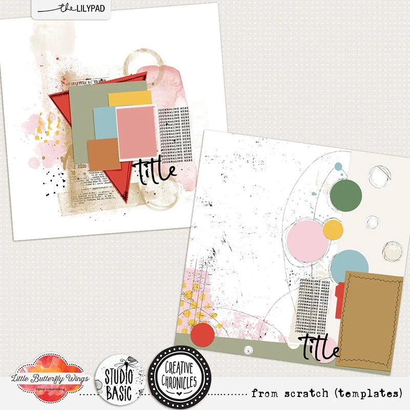
For the first one, I’m starting with this Creative Chronicles: From Scratch template pack by Little Butterfly Wings & Studio Basic. The big triangle and smaller stack of shapes as the bones of the design I’m following will allow me to use multiple papers and that triangle as the anchor piece feels like a traditional feature.
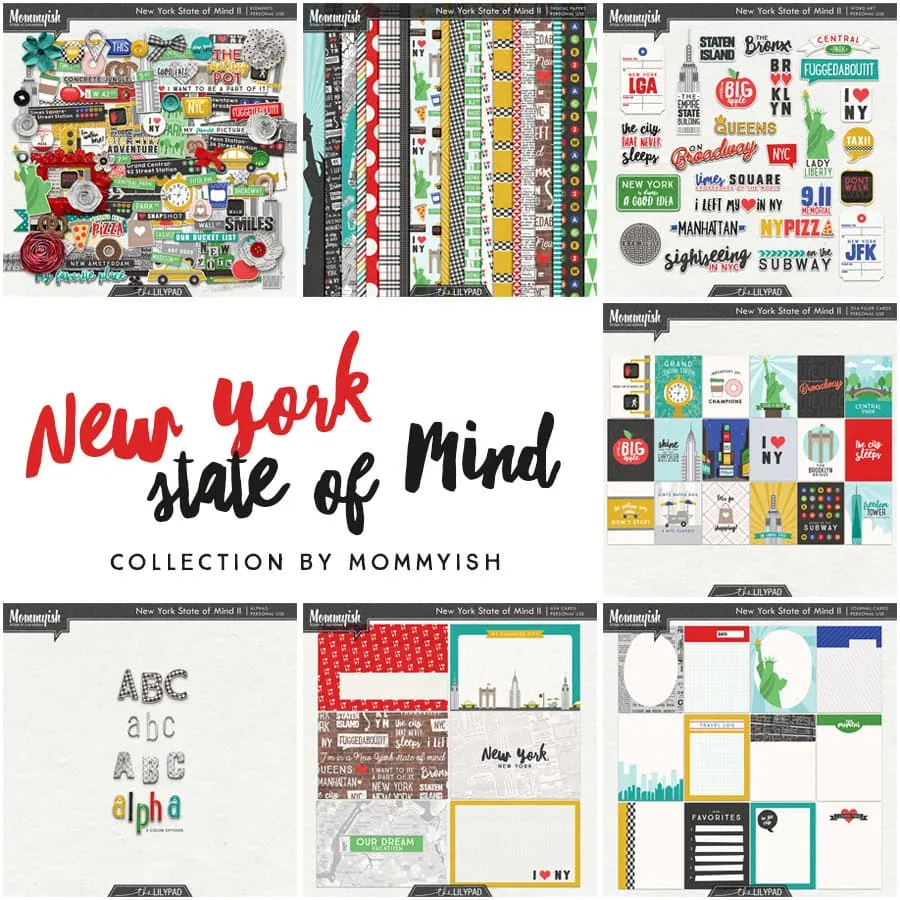
Here’s my photo and a few elements from Mommy-ish’s New York State of Mind collection
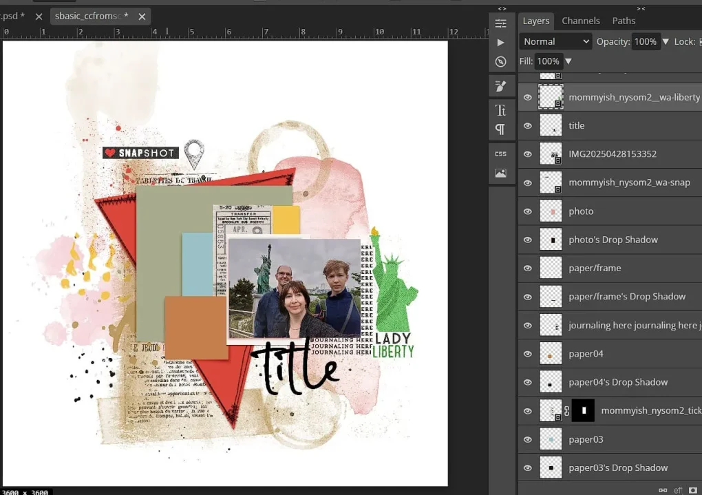
And now with a few of the artsy layers turned off the bones of the template are clearer and this looks and feels a lot more traditional and I just scrapped with it like any other template.
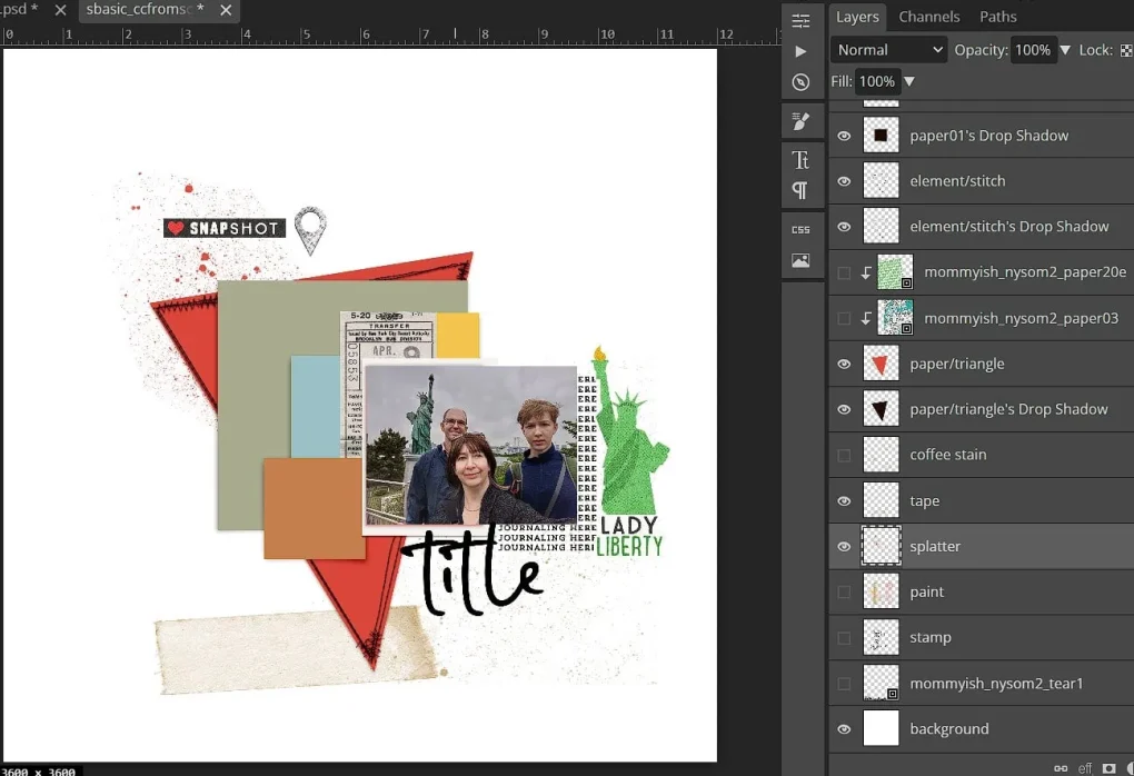
Jumping to the end, I’ve used a mix of coordinated paper layers from New York State of Mind with traditional elements like ribbons and stickers, with clean lined alphas and a block style journal font in a linear design. Keeping more minimal mixed media from the From Scratch template like the ink spray and tape outline as well as relatively clean stitching fastening around the edge of the paper triangle gives this interest without being overtly artsy.
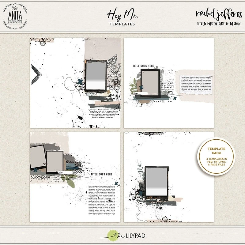
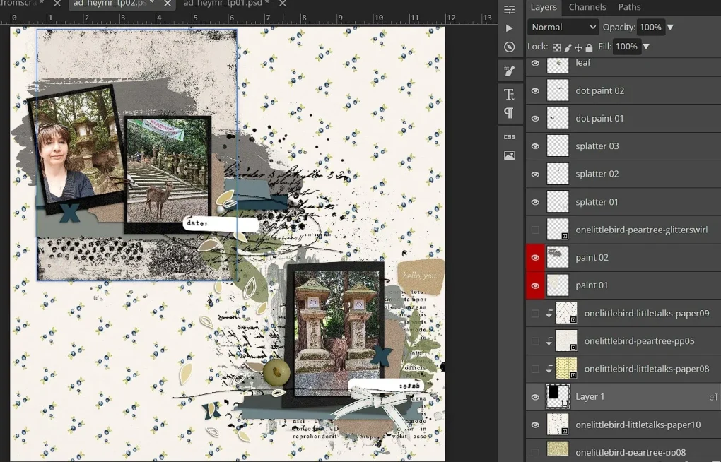
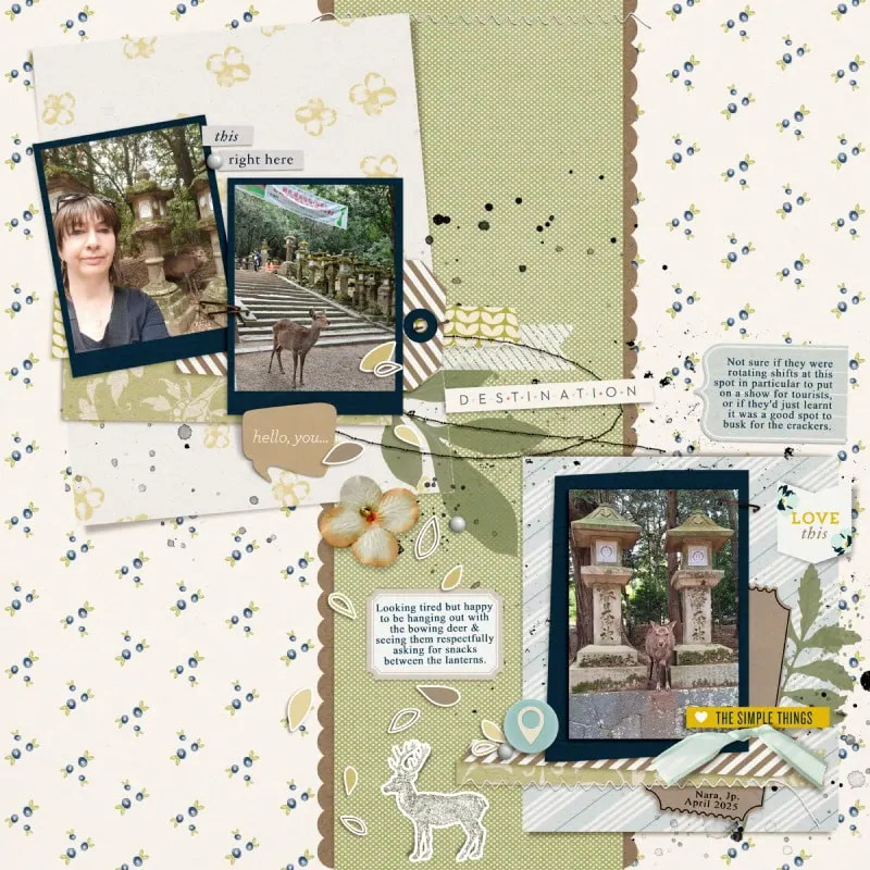
With this other example layout. I’m starting with an easy mash-up, combining 2 artsy templates from Hey Mr. templates by Rachel Jefferies & Anita Design so I had more photo spots and less negative and journalling space. I used the bottom left & top right ones and just added the photo cluster of the top right template in the journal spot of the bottom left template.
In the next steps, I turn off paint and script brushes; but first I just dragged a rectangle shape to replace the large grey paint block behind the photo frames at the top, then used the same idea under the bottom photo, substituting paper mats for some of the larger paint blocks.
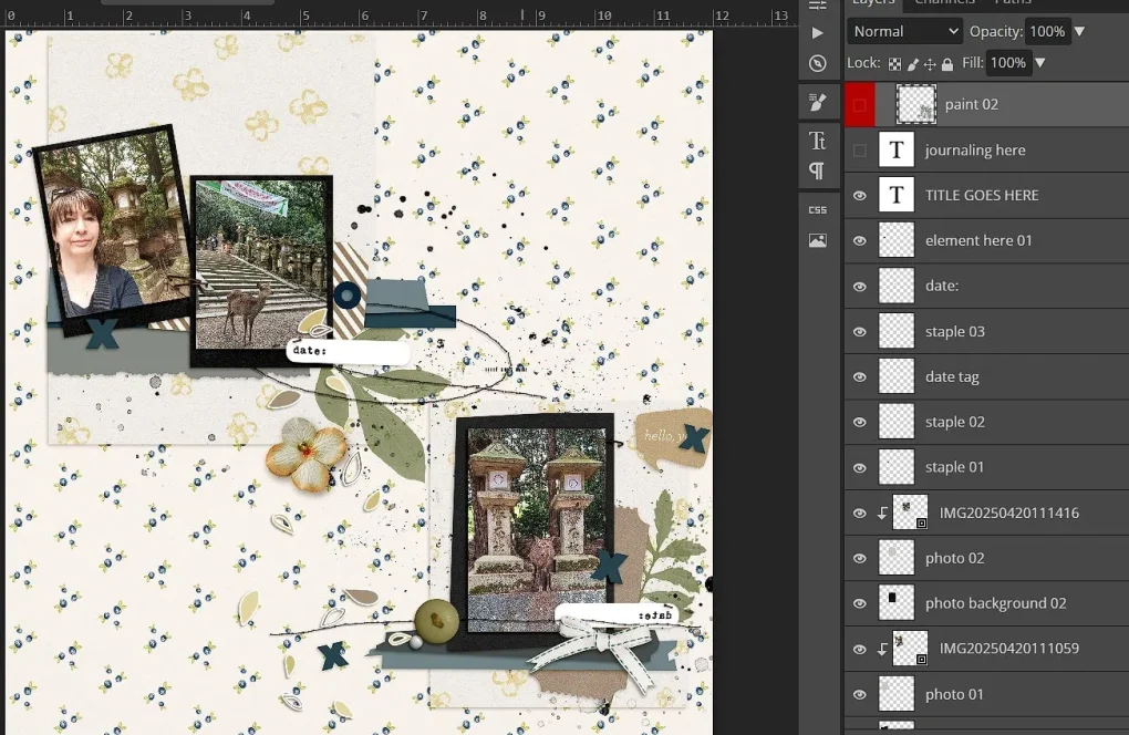
I then linked the 2 sides with a scalloped edge strip down the middle (the scallops are just clipping mask made with a basic circle brush at 100% hardness that overlaps (spacing is around 70%) dragged down the page while holding shift to give a straight line). Everything is mixed & matched from One Little Bird kits so I’ve used traditional elements like stickers, journal labels, a shipping tag, ribbon and small fabric flower, along with fairly small prints like the florals and diagonal stripes. I switched some of the black stitching from the templates for the cleaner white zig zag but kept the black straight stitched oval, small splatters and stampy green leaves but these could be replaced with ‘real’ leaves (not generally my style though in paper scrapping or digiscrapping). I also stuck with a basic, more typed style of font for the journalling.
So in summary, beyond the template, there are several design choices within our control that can stretch our stash of templates and make a template categorised as Artsy into the guide behind a cleaner traditional layout (and vice versa). So try not to pigeonhole your stash of templates, or other products for that matter, enjoy playing with them and exploring the extra possibilities they present and don’t let them limit your creativity and memory keeping.


What a fantastic way to stretch those more artsy templates.
Great ideas! And I love your sample layouts too!