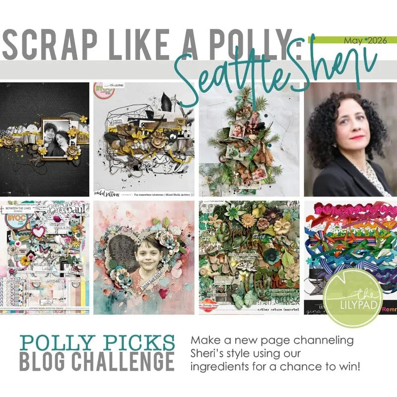
Polly Picks: Scrap Like *Sylvia* Challenge!
Welcome to the third edition of our newly revamped Polly Picks series, where each month we will chat with one of our Pollys about their scrapbooking style and fave things and give you the chance to win a $5 code for the store just by scrapping like them.
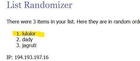
Before we jump into the July challenge, let me announce the random winner from our June challenge – big congrats to LuLuLor ! (You’re prize will be sent shortly through conversations so watch out for that this week!)
This month we are featuring *sylvia*! Sylvia has been catching my eye in the gallery and around digiland for years and years before becoming a Polly. Her style is always dynamic and I would say graphic. She can do bold and soft equally well in her minimal style, and can be both clean and artfully messy! She uses negative space and mixed media so well to create impact and convey emotion. Her gallery which is here is proof that ‘less can be more’. I’ll link some specific pages below when we get to the challenge part from her gallery that caught my eye and feel to me like they are definitively her.

Let’s get find out more about Sylvia’s scrapping from her with an interview. Here’s my Scrap Like A Polly Q&A with *sylvia*.
Your digiscrapping history and style:
1. How long have you been digiscrapping and has your style changed since then?
I started digital scrapbooking around 2005. I was in a forum that offered a beginners’ course. Right from the start, my style was minimalist, everything simple, clear and without frills. Over the years and through my CT work and participation in challenges, I have tried out all sorts of things. Templates, clusters, borders and lots of photos on a layout have lost their horror. I avoid journaling that becomes too personal. But my personal and very own style is and remains the white space.
Your page focus and process:
2.What do your layouts usually focus on and how do you usually start a page
My layouts usually focus on the foto(s) or on a message if I create Artjournaling.
As a CTM, I always start with the product. I look at the papers, elements and wordarts and then I already have an idea for the layout in my head. For my personal layouts, I always start with the photos and then look for the right papers and elements.
Your must-have products:
3. Is there a specific type or category of element you must have on a layout?
My must have No 1 is the flower. I do love brushes, overlays, messy threads, bead …
4. Are you most drawn to patterned papers or solids for backgrounds?
If it were up to me, I would only need white paper in all its variations. LOL. The paper thing has also changed over the years. In the beginning I only used solids. Today I also use patterns and artsy papers. Sometimes I start with a solid paper and then swap it for a patterned or artsy paper at the very end, because that gives the layout the finishing touch for me.
Examples of your gallery faves:
5. Can you share 3 fave pages with us and tell us a bit about why you love them?
That’s going to be difficult now, because I actually like all my layouts …
Here’s one from my early days at The Lilypad. This layout is very typical for me – very plain and simple. And it also shows something that I attach great importance to. Shadow. You can use them to create so many effects and make the layout look more realistic.
I made this layout for a challenge. The extraction was a challenge. At that time, Photoshop didn’t have a clipping tool. I always try to think a little outside the box, especially when I take part in challenges.
The third layout stands for Artjournaling. I recently discovered this type of scrapbooking. I’m still finding it difficult to implement the message visually and, above all, in my style.
Thanks for that Sylvia! I completely understand what you mean about struggling to convey a message visually in the Art Journalling style (I have the same issue) but I love that you are enjoying exploring that anyway and I kind of laughed at the only white paper comment and then changing your papers at the end, I can relate to that as well!
Now it’s your turn to Scrap Like A Polly!
Just scrap a new page using the ingredients listed below that channel the featured Polly’s style and upload your page to the TLP gallery and come back here and post the link to your page in the comments please.
These pages helped me come up with the ingredient list below and my own *sylvia*style layout.
In looking at this collection that I pulled from Sylvia’s gallery I noted that:
- Sylvia is great at using negative space to enhance messages and images,
- photos (or art journal imagery of people) are often small but minimal element use allows them to still be a dominant feature on the page;
- solids or minimal patterns and mixed media ground the design,
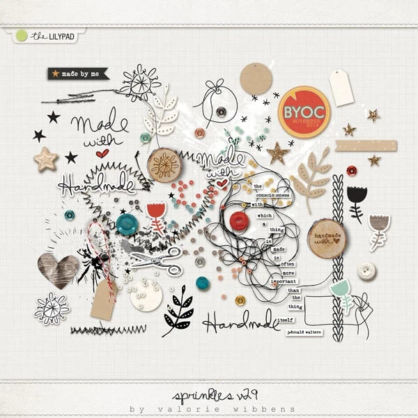
- word art or text; flowers and leaves; paint splatters or stamps are consistently used elements
- photos are often used as part of a cluster with a few select elements, but clusters can also extend and flow creating movement on the page like a scatter
- her digital pages feel casual and elegant at the same time. They seem effortless and ‘real’ because not everything is perfectly aligned. There are angled lines of elements and blends within text that creates authenticity and an organic flow to each page design.
Following on from that, these are the ingredients you need to use to Scrap like *sylvia* and make your page for this challenge:
- Create a minimalist style page (with at least 1/3 of the page as negative space)
- Use 1 or 2 small photos
- Use some mixed media (doodles, transfers or paint)
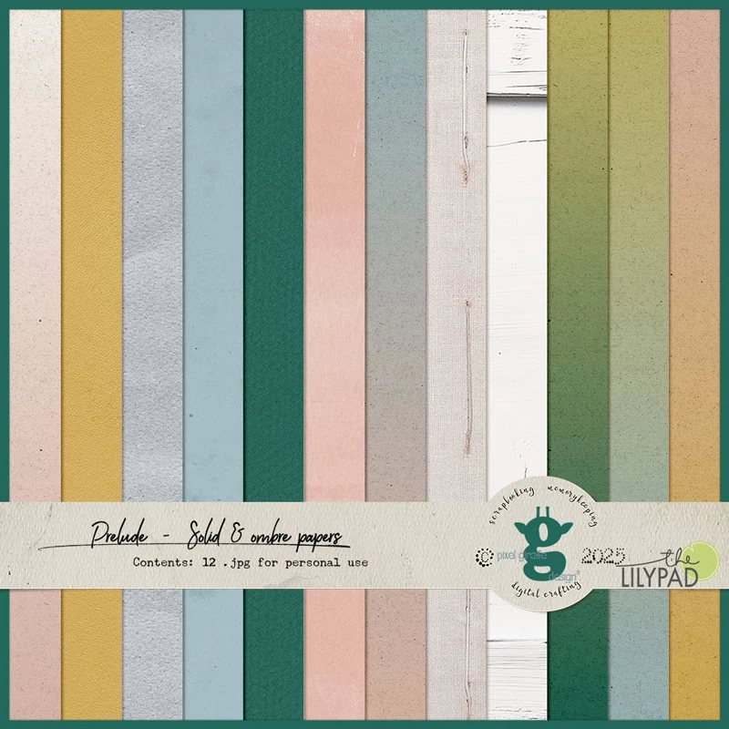
- Use a single solid-style paper background (no obvious patterns)
- Include wordart
- Include a flower or nature element
- Include a scatter or sprinkle of tiny elements
Let me show you some currently available goodies that suit scrapping in Sylvia’s style that might help kickstart your scrapping and then the page I made channeling my inner *sylvia*!
This is the page I created in Sylvia’s style. I’ve used Fernweh Collection by Anita Designs and Rachel Jefferies. To give it a more ‘perfectly imperfect’ look, I’ve tweaked some shadows to make even the perfectly straight items look like they are lifting or slanted slightly, and purposely rotated some elements and text to not be straight. The subtle creases and mix of tones and texture from the background and mixed media hopefully contribute to this authenticity as well
Now it’s your turn! You have from now until the next Polly Picks post in the last week of August to scrap like *sylvia* using the ingredient list above. Feel free to use products from any designer currently selling in the TLP store and add anything extra to the ingredients to make your layout. Don’t forget to link me to your page in the comments for your chance to go in the random draw to win. We also have a Polly Picks gallery category to pop your page in – it’s here.
The deadline is 22 August. Can’t wait to see what you create.
Thank you, I admire the clean look of Sylvia’s scrapping
Hi Olga,
I had to update the comment to remove the image url. It doesn’t show in the comments.
I love Sylvia’s style, she makes magic with very few elements. She’s a queen of white space.
https://the-lilypad.com/forum/galleries/oysters.593014/
I love Sylvia’s style, it’s always a real pleasure for me to admire her pages in the gallery. I tried to copy her following Justine’s instructions!
https://the-lilypad.com/forum/galleries/coffee.593190/