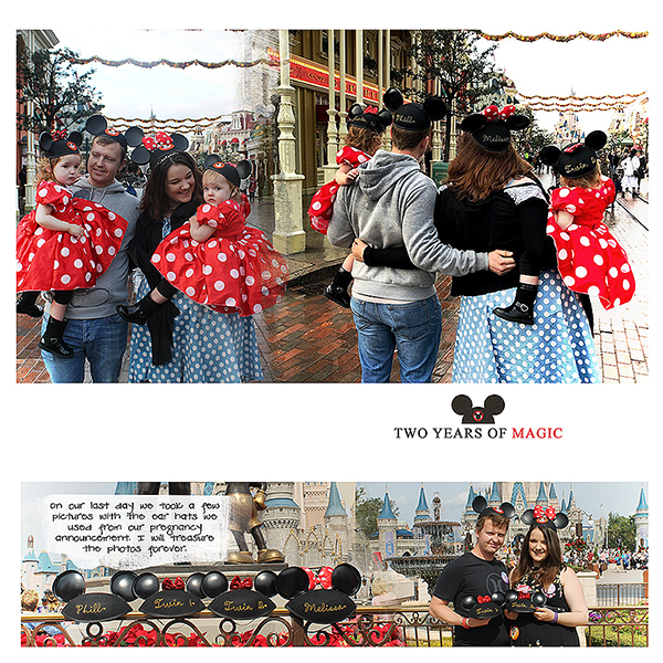
Fun challenge, thank you so much. It worked out perfectly for these photos I wasn't quite sure what to do with, hard to believe they were taken two years apart.
#3 requirement kills me....so, I have a question. The images on the magazine pages DO have shadows and dimension...is it ok to create a page/card/etc and put it on our magazine page as a flat image, with no shadow around that? Great challenge though! ♥
I am so loving the pages created for this challenge! I didn't have much luck with inspiration in the magazines I had on hand! This was inspired by an advertisement in Real Simple.
WHEW! I loved this challenge idea! But I was surprised that the execution was so complicated! So many elements just don't "jive" easily with this style. So I finally finished and decided enough is enough. I might try an AJ version- maybe shoulda done that in the first place, LOL!
I think I forgot to post my layout. Forgive me if its already in this post, but I can't find it. Im not even sure I like my layout
so we don't have to post a picture of the magazine we used as inspiration? Just want to make sure because if we do I don't know how to do that without uploading to the gallery. LOL
It doesn't say anything about using a specific magazine page as inspiration in the initial post, just following those features which are common to magazine layouts - graphic style, bold headlines, no shadows.
OHHHH EMMM GEEEE -- it feels like this was so hard -- searching for some sort of element that can be flat, a super simple banner to help text show up on the page -- and NO shadows (so hard not to go play).