Art Muse Challenge Highlight : Week 3 Neutrals
Hi there, Polly Stefanie here with the third week’s monthly muse challenge, you can find it in the forum, HERE.
This week is hosted by Ona (wombat146).
This week we are looking at the neutrals palette, the whites, blacks, beiges, creams and browns. But what exactly IS a neutral colour?
In the first instance neutral colours are defined as hues that appear to be without colour and typically will not appear on the colour wheel. Neutral colours do not compete with primary and secondary colours and instead compliment them.
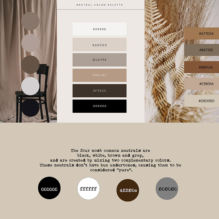
The four neutral hues that are considered to be ‘pure’ (without any hue undertones) are black, white, brown and grey as they are created by mixing two complementary colors.
All other neutrals are considered to be ‘near’ neutrals as they have a hue undertone. They are created by combining a pure primary colour with a pure neutral, the resulting tones colours down to such an extreme that they look like they don’t have any colour eg. think of light grey, tan, ivory, eggshell etc.
Take a look at the preview below which shows the four ‘pure’ neutral hues at the bottom and an example of the ‘near’ neutrals in the colour palettes shown at the top.
In the world of interior decoration neutrals colours are popular in creating a versatile background: the neutral complements the other colours in an arrangement and allows the eye to easily flow between focal points.
Likewise, in the world of art, neutral colours are an important component of art, providing the eye with a resting place and providing contrast to the darker colours that are used.
Challenge Week 3:
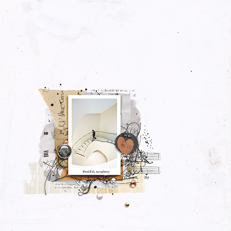
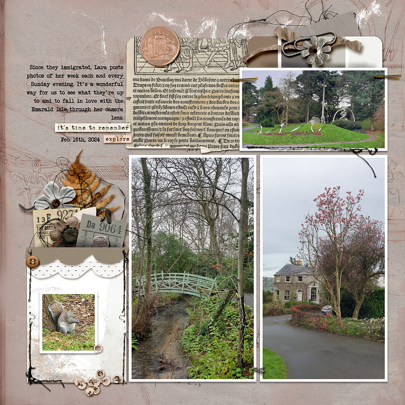
Create a layout using pure neutrals and/or near neutrals. The topic/theme of your layout can be about anything you like.
from Ona,
from ajm
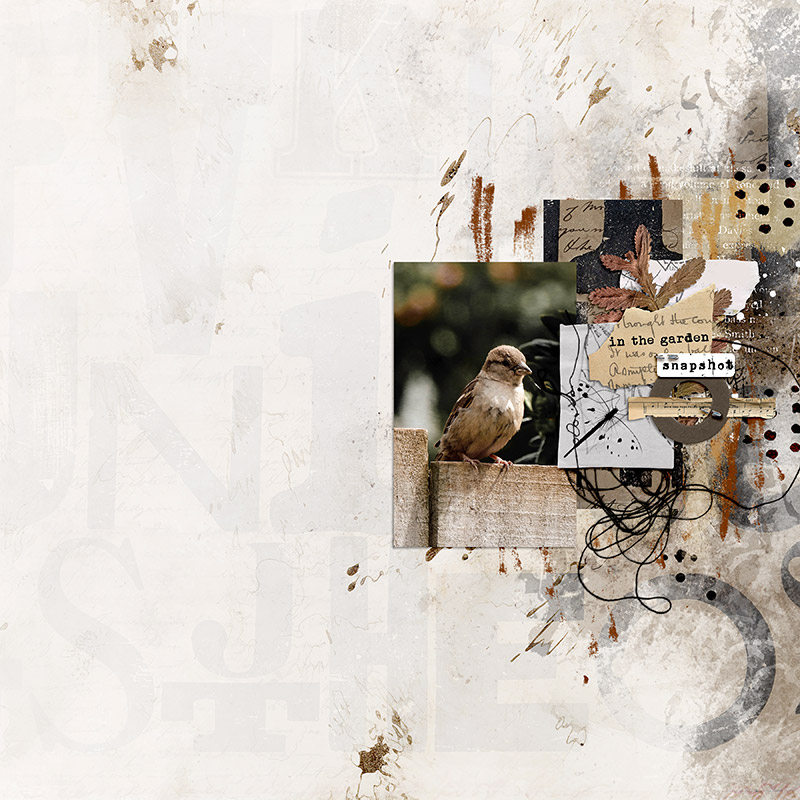
 from me
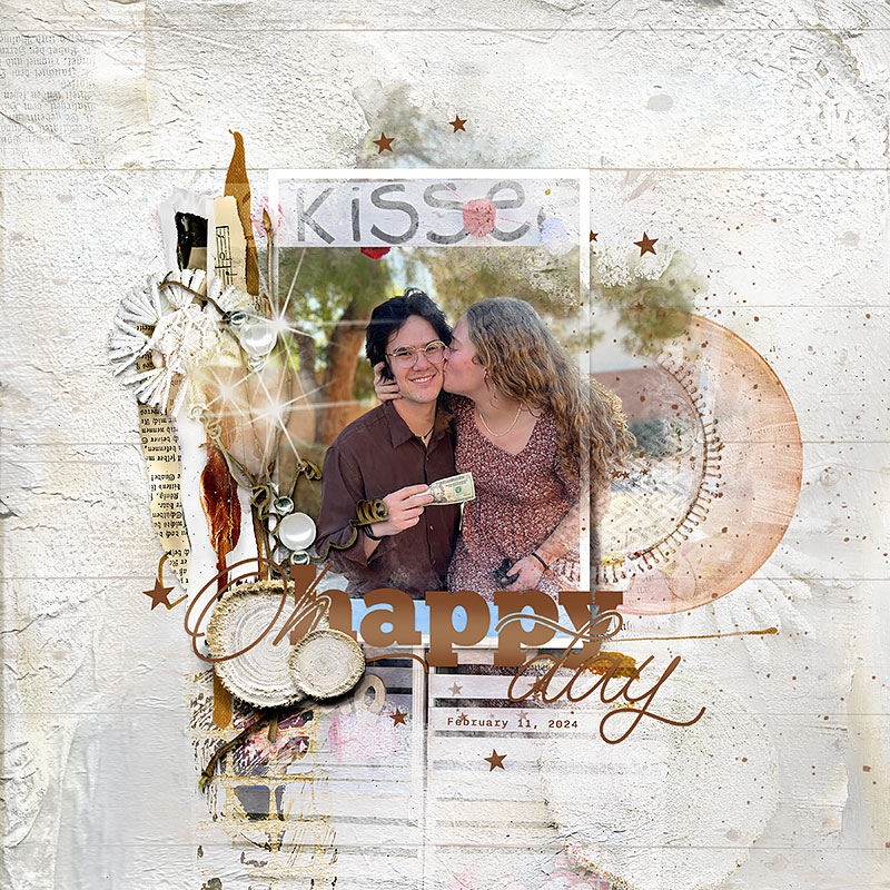 from garrynkim
We would love it if you felt like playing along.