January 24: Color wheel / Complementary Colors

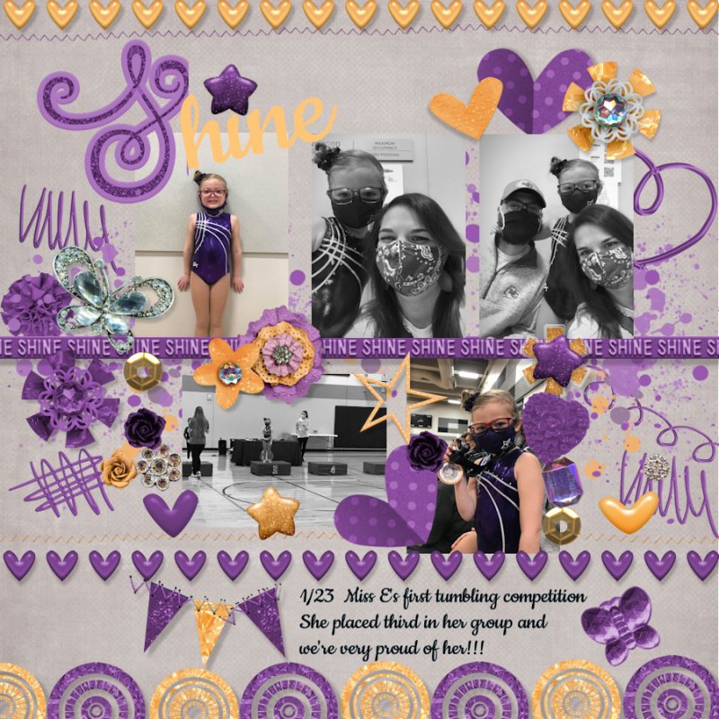
Here's my layout for today's Complementary Colors (Color Wheel) challenge, created using Bella Gypsy's Shine and Unstoppable collections:

https://the-lilypad.com/forum/galleries/01_24-color-wheel.460304/

full
 
This one was fun... I really wanted to use the colored photo... I chose the orange because the shirt was orange plaid... but in the end you were right... the B & W really made it pop... obviously my colors were orange and blue... pick a shade... My great Grandson last fall... he went from being a little boy to a young man in the blink of an eye!!! my head is still spinning!

 
I was slightly surprised to find that the complementary color to the purple in my morning glory photo was an almost lime green! Thankfully, I had Kim Jensen's Twilight kit in my stash, as it had the perfect colors.


Thanks for this challenge - I learned a lot about complementary colours! Things like, I always thought it was bright red + bright green but red actually pairs with teal?! So fun to see the colours wheel in a new way. :) I used #9ab3a3 and #B39AAA.
 
I think I made this much harder than it needed to be; my logical brain struggled. First my colors -- I just couldn't seem to get the color in the color wheel the shade of pink I had in my mind -- so I ended up just going with the pinkish color on the button in the template - accepting the version of green that adobe told me was the complement. I tweaked those colors in the kit, but honestly I prefer the original colors and a bit more variation. I think that is a cool feature that I didn't know about in PSCC. My colors are actually a bit more toward the red/green than the bright pink/lime I wanted.


cf2761/14ae22
 
Back
Top