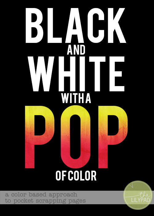
Black and White with a POP of Color
Recently, I was inspired to try a different approach to my pocket scrapping pages. I had seen a lot of layouts that used mainly black and white with small pops of color. I was amazed at how eye catching working with mainly black and white could be, so I decided to give it a shot on one of my weekly spreads.
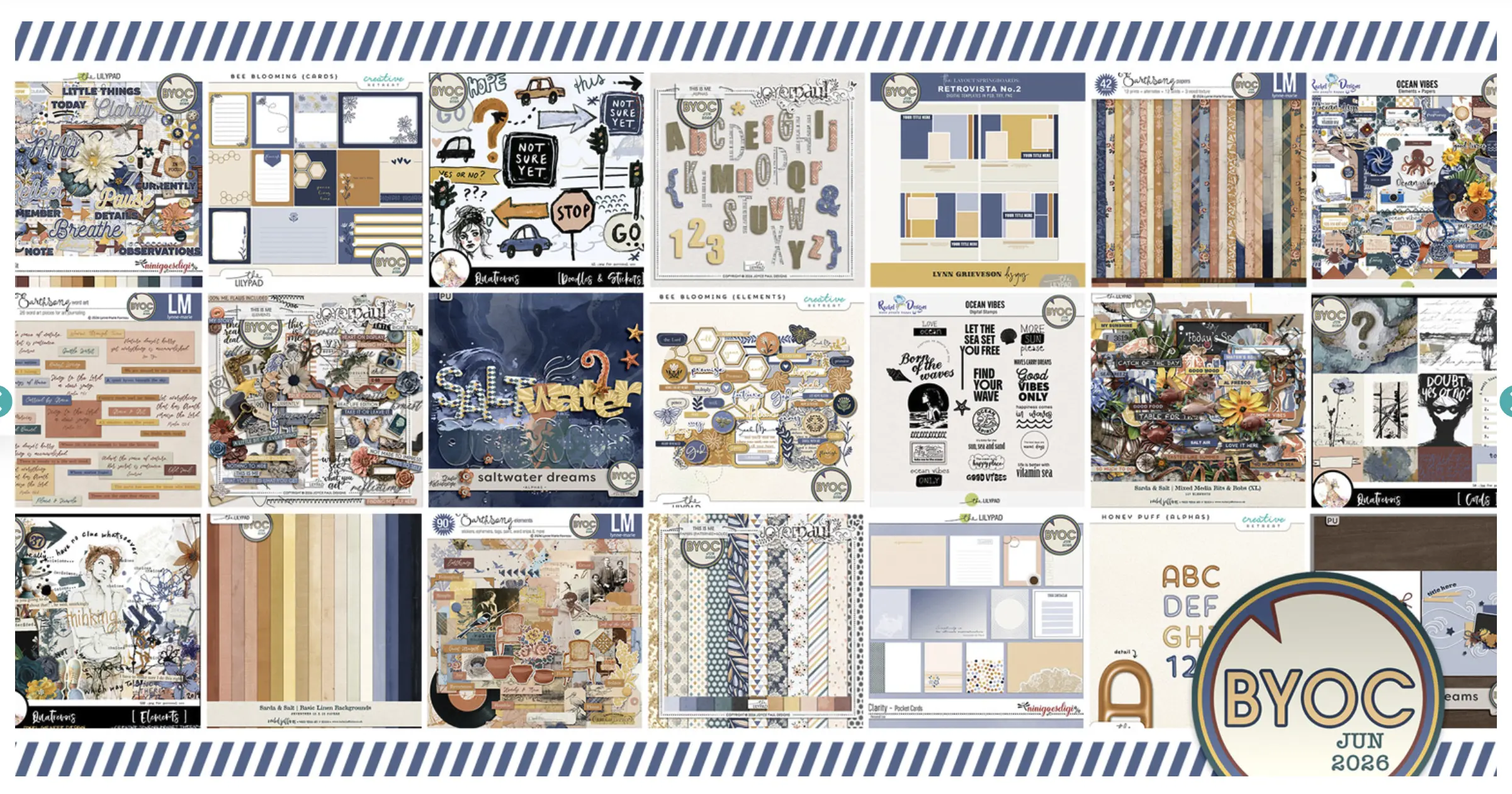
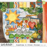
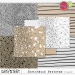
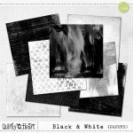
I started by gathering materials. I went through the store looking for black and white products that seemed to go together. I also looked for something with the same look and some really nice and bright colored elements that I would be able to use on my spread. In order to keep the “look” of the page along the same lines, I decided to go with products from the same designer, Quirky Heart. These are the products I used.

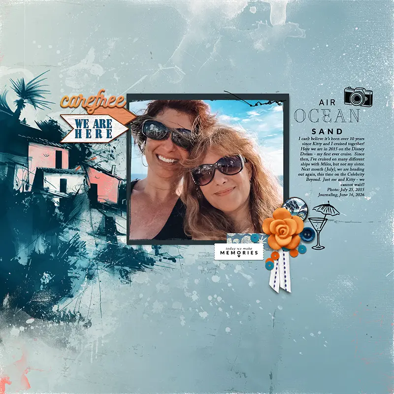
I started the spread like I usually do, putting in the pictures and the cards I use on every page. Once I had that placement down, I started by adding in the black and white. My goal was to use only black and white for the cards and papers. I thought it was easy, but it was surprisingly hard. I found myself wanting to use a paper with color, or a card that had a touch of something, but I stuck to my original plan. After I placed all of the papers and cards, I opened up Sunshine and Grass Stains and started looking at the elements I could use. One by one, I picked an element and carefully placed it onto the spread. I focused on adding color where my eye was looking for some. I didn’t rely on the visual triangle or the rule of threes like I usually do, I just went with what I thought looked “right.” I didn’t add a pop of color to every card, or every photo spot. I felt like it was important to leave a good amount of black and white undisturbed. When I was done, this is what I was able to share.
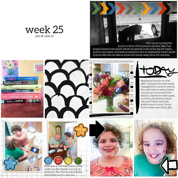
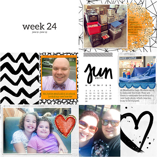
I was so very pleased with the results. I found that working with black and white and only small pops of color really created an eye catching spread. I also found that my photos stand out a lot more than they do on my usual pages. I did find it a lot harder to work within these color constraints, however. Next time, I would like to try black and white, and use pops of only one color. Have you ever used mainly black and white on a layout?