WELCOME BACK ART JOURNALERS!

Discussion in 'Art Journaling' started by Dalis, Feb 1, 2016.

  1. Dalis

    Dalis Jose Cuervo is NOT a good friend

    Messages:
    22,456
    Joined:
    May 6, 2011
    Ok, I didn't have time to finish, since I am doing a gazillion things at the same time.... squirrel!

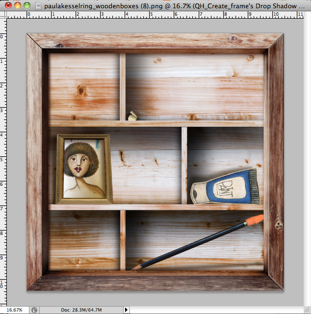
    I just wanted to show you what I have so far! I just noticed my shadows are at the wrong angle! oops!

    [​IMG]
     
    paula kesselring, cfile and mcurtt like this.
  2. Cath_

    Cath_ In my polka dot dress and apron

    Messages:
    6,501
    Joined:
    Dec 12, 2014
    [​IMG]

    i used u'r settings, my eyes don't see the differnce on above


    reason, memory for dad
     
    Last edited: Feb 4, 2016
    Mylinn and cfile like this.
  3. carilyne

    carilyne It's only impossible if you think it is

    Messages:
    4,429
    Joined:
    Dec 30, 2014
    It's looking good. It is a subtle change but look at the safety pin and coil (?). You can see it more. It just makes it pop out a little more.
     
    Cath_ likes this.
  4. Nemla

    Nemla Stretching my skill set

    Messages:
    7,446
    Joined:
    Apr 24, 2013
    I knew I had done one before LOL, I did this for moc 2014,.....
    Now all I have to do is remember how I did it :giggle
    [​IMG]
     
  5. cfile

    cfile My bags are packed for Platform 9 3/4

    Messages:
    23,947
    Joined:
    Sep 2, 2011
    I definitely see the difference.. the items really pop with the darker and deeper shadow
     
  6. NancyP

    NancyP All you need is a little bit of pixie dust

    Messages:
    2,072
    Joined:
    Jan 16, 2014
    Love looking at those shelves!! I purchased the boxes kit, but would still like the challenge of trying to make my own. We shall see-----:eyeroll
     
    Dalis likes this.
  7. Dalis

    Dalis Jose Cuervo is NOT a good friend

    Messages:
    22,456
    Joined:
    May 6, 2011
    @Cath_ , look at the nails on the first column, rows 1 and 2. They look like they are laying down instead of floating.
     
  8. redplaid3

    redplaid3 Just call me Zaley's Grammy!

    Messages:
    4,514
    Joined:
    Aug 22, 2012
    I made mine, a la vintage style. Sugar Lump Studios does a lot of these little "shrines." Looking at them helped me a bit with the shadows, but I still don't feel they're right. I'm open to suggestions....please!!!! I want to learn how to do this. For example, the butterfly shadow isn't right, is it? And what about the string of buttons.

    [​IMG]
     
  9. redplaid3

    redplaid3 Just call me Zaley's Grammy!

    Messages:
    4,514
    Joined:
    Aug 22, 2012
    I like your beginning!
     
  10. paula kesselring

    paula kesselring Designer

    Messages:
    4,415
    Joined:
    Feb 18, 2011
  11. cfile

    cfile My bags are packed for Platform 9 3/4

    Messages:
    23,947
    Joined:
    Sep 2, 2011
    Linda, re the buttons, if you are using PS (cc) then create layer of the shadow by clicking on the buttons and right click with your mouse and it will bring up a drop box.. choose create layer to separate the shadow from the buttons. (any other program, click on buttons with your magic wand and on new layer underneath buttons fill with black or a dark brown) then offset the shadow layer to the right or to the left whichever your majority of shadows goes... for your box it goes to the right so shift the shadow to the right a bit and maybe warp it or soften it a little (the shadow) with a glaussian blur. The Butterfly looks good. If you wanted you could use the warp to bend the shadow a little more but I do not see the need to do that. I think it is really cute Linda. I would just tweek the buttons a little
     
    redplaid3 likes this.
  12. lorryfach

    lorryfach Likes to be chauffeured

    Messages:
    11,533
    Joined:
    Jul 13, 2011
    Like Christa, I would separate the shadow. For the part that is attached to the frame, it's fine, so I'd select that part and separate it from the rest (Layer / New / Layer via cut). Then move the rest down so the shadow is more offset, since there is a bigger distance between the buttons and the back of the box.

    I don't see anything wrong with the butterfly!
     
    redplaid3 likes this.
  13. Dalis

    Dalis Jose Cuervo is NOT a good friend

    Messages:
    22,456
    Joined:
    May 6, 2011
    Ladies, I am heading out for the a hockey weekend, with internet connections so bad it's better to say no-internet available.
     
  14. NancyP

    NancyP All you need is a little bit of pixie dust

    Messages:
    2,072
    Joined:
    Jan 16, 2014
    Well, its not the best because the photos weren't the best, but I had fun with it!!!!

    [​IMG]
     
  15. carilyne

    carilyne It's only impossible if you think it is

    Messages:
    4,429
    Joined:
    Dec 30, 2014
    How precious though. Wow you did a lot of work.
     
  16. Cath_

    Cath_ In my polka dot dress and apron

    Messages:
    6,501
    Joined:
    Dec 12, 2014
    this the most adorable thing i have ever seen


    redplaid3 likes this.
  17. carilyne

    carilyne It's only impossible if you think it is

    Messages:
    4,429
    Joined:
    Dec 30, 2014
    This is so cute. I don't know enough about shadows to be a big help. The butterfly looks good but is it what you want? if you want it looking like more toward the middle of the box then maybe a bigger shadow or separate shadow and move it a bit.
     
    redplaid3 likes this.
  18. Ga_L

    Ga_L Well-Known Member

    Messages:
    9,904
    Joined:
    Jul 7, 2013
    Mylinn and paula kesselring like this.
  19. thimbleberrie

    thimbleberrie Oooh, shiny!

    Messages:
    716
    Joined:
    Jan 17, 2013
    I need to work on shadowing a bit more -

    [​IMG]
     
  20. weaselwatchr

    weaselwatchr Viva, Las Vegas!

    Messages:
    6,799
    Joined:
    Apr 13, 2013
    I will probably make one on sunday...I hope if work cooperates...
     
    Dalis likes this.

Share This Page