FarrahJobling
FarrahJobling
- Joined
- Dec 17, 2012
- Messages
- 6,974
Today we are talking about 50 shades of gray....50 shades of gray in Black and White Photos!
The problem with BW photos is 2-fold....1- WHAT makes a great BW photo and 2- HOW to create a great BW look?
The answer is, and it works for both WHAT and HOW is HIGH CONTRAST! We DO NOT actually want 50 shades of gray...we want BLACK and WHITE
Turning a picture into a good black and white is fairly simple but there are a few basic rules you need to follow. First and foremost is to make the blacks very black and the whites very white.
The methods from my previous Color POP Technique Scrap are the very same to make a BW photo POP.
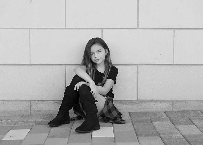
First, we have to convert our photo to Black and White. You can start by clicking "desaturate" or click the layer "black and White"....but I get an image that literally has 50 shades of gray...blah and boring
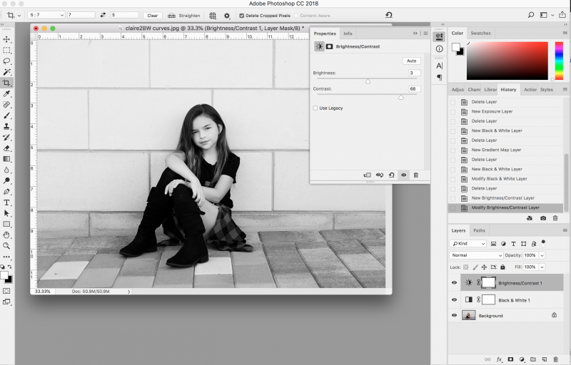
1. CONTRAST- the easiest way of adding a pop is to add contrast to a "brightness and contrast layer.
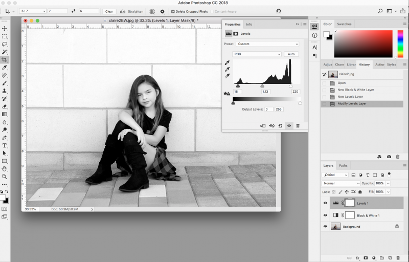
2. LEVELS- using the levels layer adjustment, you can play around with the sliders for the shadows (black triangle), grays (gray triangle) and the highlights (white triangle). Play around until your black are black and your whites are white. The gray area is literally a gray area and depends on your preference.
3. CURVES- Adding an "S-curve" curve layer will also give you whiter whites and blacker blacks. Pull down on the shadows (the left most 1/4 on the grid) and up on the highlights (the right most 1/4 on the grid). Notice that the middle of the curve stays in the center of the grid. **NOTE: this option is NOT available in PSE**

So...play around with your photo and see what looks the best to you.
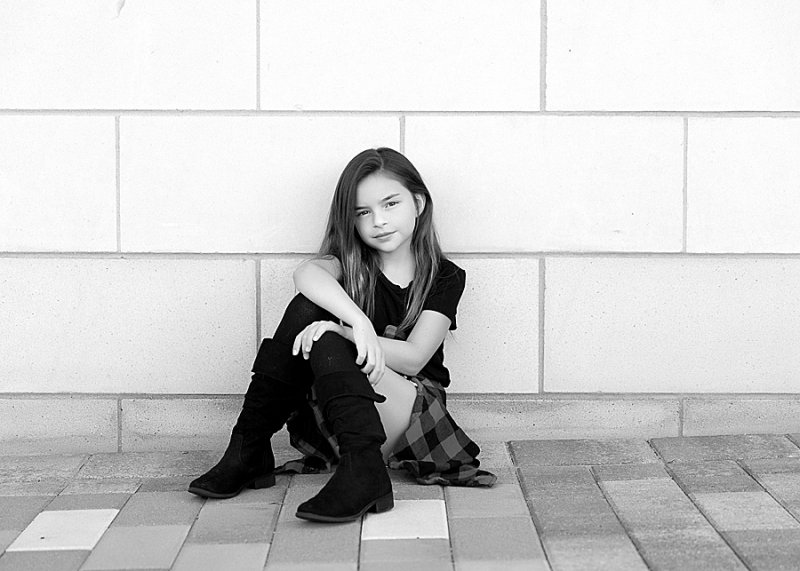
Here is my final image:
Here are today's instructions:
Please post your completed layout in The Lilypad gallery. GALLERY RULES: Layouts must contain at least 50% TLP products. (Templates count as 15%.) Uploads must be less than 250k. List all credits; no off-site linking allowed.
1. CREATE A LAYOUT USING A BLACK AND WHITE IMAGE WITH HIGH CONTRAST. (NO 50 SHADES OF GRAY)
I can't wait to see everyone's take.
You have 24 hours to finish your pages. Layouts are due Thursday, October 17, 2019 at 12pm Eastern time. Please load you pages to THIS gallery and post them below. Have fun!!!
The problem with BW photos is 2-fold....1- WHAT makes a great BW photo and 2- HOW to create a great BW look?
The answer is, and it works for both WHAT and HOW is HIGH CONTRAST! We DO NOT actually want 50 shades of gray...we want BLACK and WHITE
Turning a picture into a good black and white is fairly simple but there are a few basic rules you need to follow. First and foremost is to make the blacks very black and the whites very white.
The methods from my previous Color POP Technique Scrap are the very same to make a BW photo POP.
First, we have to convert our photo to Black and White. You can start by clicking "desaturate" or click the layer "black and White"....but I get an image that literally has 50 shades of gray...blah and boring
1. CONTRAST- the easiest way of adding a pop is to add contrast to a "brightness and contrast layer.
2. LEVELS- using the levels layer adjustment, you can play around with the sliders for the shadows (black triangle), grays (gray triangle) and the highlights (white triangle). Play around until your black are black and your whites are white. The gray area is literally a gray area and depends on your preference.
3. CURVES- Adding an "S-curve" curve layer will also give you whiter whites and blacker blacks. Pull down on the shadows (the left most 1/4 on the grid) and up on the highlights (the right most 1/4 on the grid). Notice that the middle of the curve stays in the center of the grid. **NOTE: this option is NOT available in PSE**
So...play around with your photo and see what looks the best to you.
Here is my final image:
Here are today's instructions:
Please post your completed layout in The Lilypad gallery. GALLERY RULES: Layouts must contain at least 50% TLP products. (Templates count as 15%.) Uploads must be less than 250k. List all credits; no off-site linking allowed.
1. CREATE A LAYOUT USING A BLACK AND WHITE IMAGE WITH HIGH CONTRAST. (NO 50 SHADES OF GRAY)
I can't wait to see everyone's take.
You have 24 hours to finish your pages. Layouts are due Thursday, October 17, 2019 at 12pm Eastern time. Please load you pages to THIS gallery and post them below. Have fun!!!

