Clutter?

michelepixels

A pun is not fully matured until it is full groan.
Joined
Jan 2, 2015
Messages
9,108
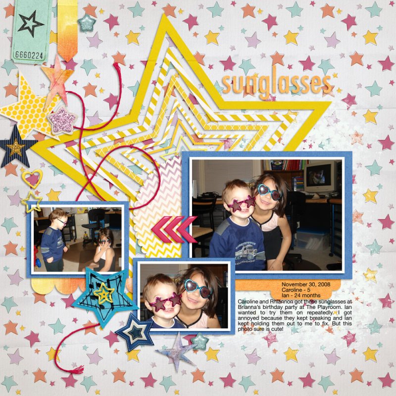
I finally found a chance to use one of Fiddle Dee Dee's awesome star layout templates today. I normally don't cluster across a whole page, but I decided to try it, following the template.

Here's what I ended up with . . .


. . . but I wasn't sure if I liked it, so after I posted it I deleted a bunch of elements, considering how much I like each one, slowly one at a time.

Now it looks like this:


Honestly, do you like the first one? Maybe I am not good at combining lots of different things, like matching color, etc. I know it only matters whether I like my page, but it really helps me to hear what others think.

Advice, suggestions, critique welcome! Thank you! :hi5
 
I think they both look good. When just the first one was showing in my screen, I thought, "Oh, nice!" If I were choosing just for myself, I'd probably go with what Cheryl calls her "Dressed Down" look of fewer embellishments as in the second layout. But that's because I prefer a cleaner look myself.
 
I think they both are excellent Michele. Honestly ... what I like more on your 2nd version : is the way the arrows/chevrons and the title interact. Both the stars "more clustered" and "less clustered" appeal to me!!! :)
 
I like both versions but I see what Jenn means about the interaction between the chevrons and the title on the second version.
 
Thanks!

I probably need to stop scrapping a while and look at it again with fresh eyes. I've made three pages today (or 4 if you consider one layout was a two-page spread)! :huh
 
I like both versions. When I use a patterned paper like yours, I tend to use fewer elements. I wonder if you would like the top version better if the background was a simpler pattern or maybe a solid with a texture?
 
I agree with BevG. I like the first one, but think a background less busy might help highlighting the elements. OR (that is probably what I would go for): A solid textured background and a paint mask towards the right (where there are no elements) as a clipping mask for the starry paper.
 
I like the second one better. The background & the giant star are already taking up a lot of visual real estate; the extra clusters of stars push it over into 'too busy' and my eyes are going a little crazy figuring out where to look.

The star clusters would really shine & become the STAR (ha!) of the show on the first page if you swapped out the background for something less busy.
 
i dont know how helpful i am either but hopefully fresh eyes Michele helped you make a decision you're happy with. I like the title placement on the second one and the extra stars on the top one (they follow the line the string takes and that to me would bring your eye to the chevron and the title). You could try switching the background to a more solid paper or just adding a brush of paint under the journal area to give that a bit of a solid grounding & extra contrast from the background
 
Michele - ask a bunch of people and you get a bunch of DIFFERENT answers. This is why there's no one right or wrong way to scrap. Hope you found something that you are happy with!!! When I am tackling a page that seems "off" to me for some reason and can't put my finger on it ... I have to walk away and let it rest for a day or two as well. In the end it has to please me. (well family too - but they like anything I make anyway). Anyway, I think you are an awesome scrapper with a beautiful, unique, creative style. Just wanted to make sure you knew that! :beat
 
Thank you everyone! I'm still just letting the two versions sit and wait. I saved both in printable versions. I don't have to decide for nearly a year because I print my annual albums in November.

I know it's ultimately up to what I like, but I learn from what others point out. Sometimes I disagree or disregard and other times they point out something I hadn't thought of but like the idea! So I like these discussions. :)
 
Back
Top