It is the start of September and that means autumn is just around corner in this part of the world! Of course, no matter what the date, nothing screams the start of autumn louder than Pumpkin Spice Lattes (PSL) and Pumpkin scones from your local coffee shop. If you are a fellow PSL fan, or even if you just like autumn, I’m here to inspire you today with a pumpkin spice page and a a quick tip for toning your background to coordinate with your elements.
Here is my layout, commemorating my first pumpkin scones of the season. As a bonus, pretty much everything in it is included in today’s half-price SOSN sale! (Click on layout for full credits.)
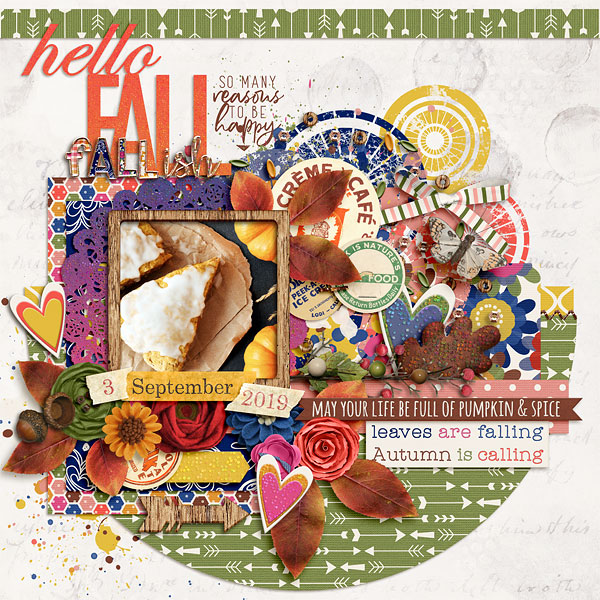
Notice the background paper? It actually comes from Little Butterfly Wings’ Whities Vol. 2 set. Although I love the texture and visual interest that it adds to the page, the background was a little to bright for the rest of the page. I adjusted the tone of the paper with the following steps:
1. Add a Color Fill layer just above the white paper and set the color using one of the elements on the page. I used the off white in the “Autumn is calling” tag. You can change the color of the color fill layer by clicking on the thumbnail and then using the eye dropper tool to pick a color from your page.
2. Once I had my chosen color, I changed the blend mode of the color fill layer to “Darken” and reduced its opacity to 39%. 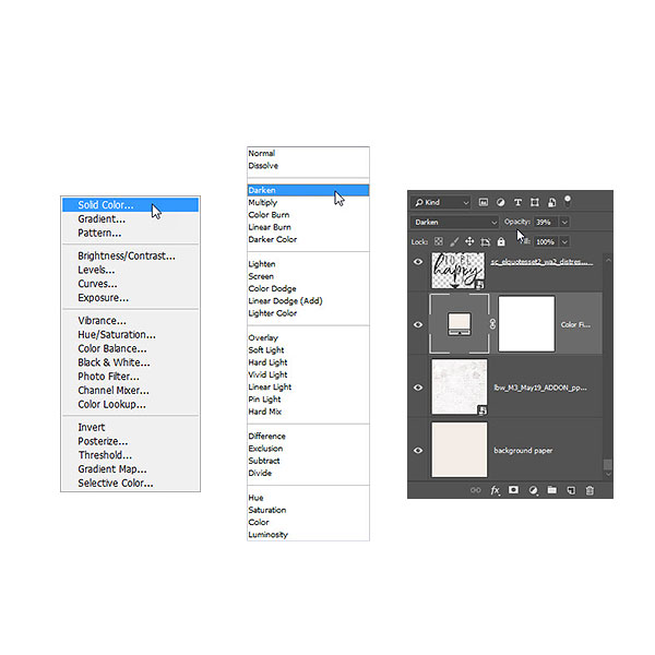 This adjustment toned the paper down just enough to help it coordinate with the elements on the page (as opposed to clashing with it). I encourage you to play with different blend modes and opacity settings for your adjustment, as they will vary depending on the adjustment color your choose and the look you want. I hope you have fun with this technique!
Until next time ~
Judie (HeyJude)
Oh my goodness, this is beautiful!!
Thank you!