- Joined
- Jun 12, 2011
- Messages
- 8,234
Welcome to Feb!
I'm back after a very busy January, we took a little hiatus to settle back into the refreshed and rejuvenated pad and as you probably know I hosted a month of challenges with Lynn over at our substack community.
One of my favourite things to do in my spare time is to create little mini five minute collages in my sketchbook with scraps of papers, a few swipes of paint and some flattish elements.
This is a fun and useful skill to learn for digital scrapbooking. Collages can make a fantastic base or mount for a photo adding depth, texture, and an artistic mixed media twist on a layout.
If you find making a Mixed Media page from scratch daunting, or just the empty background and knowing where to start, this can be a constructive way to start creating. If you find the word 'collage' daunting, think of it simply as a 'cluster' but maybe a little more eclectic or abstract - the layers don't have to be so tightly packed if you want a looser design.
Your February Challenge is to have fun creating a basic Collage on your background that you will then use as a base or mount for your photo to help you compose a page.
If you'd like a theme of sorts, I explored Growth which you could interpret as the very first signs of Spring - we are starting to see buds and the grasses of the bluebell bulbs emerging in the UK. You could reflect back on 2024, or as i, the sentiment of my child growing up.
Here are some things you will want to consider plus some base rules:

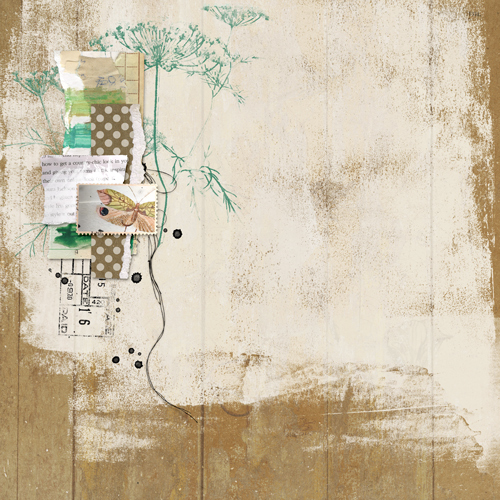
Next I decide that I actually like my background white (ish) and select a background paper that I'm happy with, the textures and marks on the papers accent my collage/cluster, I just adjust the curves to lighten it to suit.
I create my 3x3 grid using the Photoshop Settings View > Guides > New Guide Layout and decide where I want to position my collage/cluster with my photo. I decide to crop my photo into an elongated mount, it was already a portrait photo and it suits the page I thought.
I move a few of the stamps around to suit and decide which intersection my photo and collage cluster will sit. At this point i've tweaked a few colours and size of stamps and hidden the leaf for now. I plan to continue working on the bottom part of the layout and maybe keeping the trailing or the diagonal flow.

I ended up hiding more of the collage than i intended too, if I was comfortable making my photo much smaller or if it had have been square I probably would have used the cluster as it was, but it's okay to change your mind, the point is that it helped me with placement and flow and gave me some momentum to get this page created.
I've outstretched the composition a bit more now with journaling, messy threads and some subtle paint, added a fabric layer behind the black collage to break it up and I also add a few things at the top for balance / a visual triangle and I think it's done")
If it's not intuitive for you, decide on your photo placement first and then follow the same principles working behind your photo.
Whilst I love framing these with 'breathing room / negative space' I do like to finish the design by drawing the sides outwards and filling in a little of that space with foliage stamps, splatters and spots of colour, but in a delicate way.

Challenge Requirements:
I'm back after a very busy January, we took a little hiatus to settle back into the refreshed and rejuvenated pad and as you probably know I hosted a month of challenges with Lynn over at our substack community.
One of my favourite things to do in my spare time is to create little mini five minute collages in my sketchbook with scraps of papers, a few swipes of paint and some flattish elements.
This is a fun and useful skill to learn for digital scrapbooking. Collages can make a fantastic base or mount for a photo adding depth, texture, and an artistic mixed media twist on a layout.
If you find making a Mixed Media page from scratch daunting, or just the empty background and knowing where to start, this can be a constructive way to start creating. If you find the word 'collage' daunting, think of it simply as a 'cluster' but maybe a little more eclectic or abstract - the layers don't have to be so tightly packed if you want a looser design.
Your February Challenge is to have fun creating a basic Collage on your background that you will then use as a base or mount for your photo to help you compose a page.
If you'd like a theme of sorts, I explored Growth which you could interpret as the very first signs of Spring - we are starting to see buds and the grasses of the bluebell bulbs emerging in the UK. You could reflect back on 2024, or as i, the sentiment of my child growing up.
Here are some things you will want to consider plus some base rules:
- I want you to build this collage yourself, so please don't get a head start with using a ready made collaged background paper and please don't use a template, let's try this from scratch to enhance our skills.
- Consider the rule of thirds, a good base rule is to place your collage and photo / main focal point off center, but that can depend on what type of background paper you choose for your finished design and if it includes marks or design elements that may sway your choice.
- Either use guides or imagine a 3x3 grid and choose one of the intersecting points of the grid for your placement
- Encourage stacking different textures: paper shapes, fabric bits, ephemera, brush strokes, digital stamps . . .
- Place larger, softer layers underneath and smaller, detailed pieces on top to guide the eye toward the photo. I'd recommend keeping everything in layers as you may change your mind or choose to nestle your photo inbetween elements.
- Arrange lines and directional elements (strips of paper, paint streaks, text lines) to subtly lead the eye toward the photo.
- Mix light and dark tones for contrast.
- Leave breathing room around the collage so it doesn’t overwhelm the photo.
- Consider framing your focal point with 'White space' but this doesn’t have to be white—it just needs to be 'negative space'
- Shadowing - ensure the flatter items that are made from paper and layered at the back have minimal shadows, imagine your items being 'glued' down, if you use any heavier more dimensional elements on top they would have heavier shadows in contrast the lighter elements behind them.
Next I decide that I actually like my background white (ish) and select a background paper that I'm happy with, the textures and marks on the papers accent my collage/cluster, I just adjust the curves to lighten it to suit.
I create my 3x3 grid using the Photoshop Settings View > Guides > New Guide Layout and decide where I want to position my collage/cluster with my photo. I decide to crop my photo into an elongated mount, it was already a portrait photo and it suits the page I thought.
I move a few of the stamps around to suit and decide which intersection my photo and collage cluster will sit. At this point i've tweaked a few colours and size of stamps and hidden the leaf for now. I plan to continue working on the bottom part of the layout and maybe keeping the trailing or the diagonal flow.
I ended up hiding more of the collage than i intended too, if I was comfortable making my photo much smaller or if it had have been square I probably would have used the cluster as it was, but it's okay to change your mind, the point is that it helped me with placement and flow and gave me some momentum to get this page created.
I've outstretched the composition a bit more now with journaling, messy threads and some subtle paint, added a fabric layer behind the black collage to break it up and I also add a few things at the top for balance / a visual triangle and I think it's done
If it's not intuitive for you, decide on your photo placement first and then follow the same principles working behind your photo.
Whilst I love framing these with 'breathing room / negative space' I do like to finish the design by drawing the sides outwards and filling in a little of that space with foliage stamps, splatters and spots of colour, but in a delicate way.
Challenge Requirements:
- Use the guidelines above to create a basic Collage on your background that you will then use as a base or mount for your photo to help you compose a page. Remember, no ready made collage elements or templates or papers to assist in this
- Use at least 75% of Rachel's Product currently available in her LilyPad shop.
- Any remaining percentage must be product from another current LilyPad designer. This could also include retired products from Rachel or the other current LilyPad designer.
- Hybrid projects are also welcome and the same product rules apply. Where digital products are used in a hybrid project they must all come from current LilyPad designers, and at least 75% must be Rachel's Product.
- Upload your layout to the Rachel Jefferies Designs Gallery at the LilyPad with your product credits.
- For your challenge entry to be counted, you MUST upload your finished layout to this thread. Please link your gallery image to your post in this thread, as it helps us leave love on your layout (and validate your project).
- No double-dipping… your layout must be created for this challenge only, no others.
- You must create a NEW layout for this challenge.
- This challenge will remain open through February and close 28th February 2025.
- All participates will receive a coupon for my shop that will discount your next order by 15% when you spend over $8.99.
- One winner will be drawn at random to win an $8 coupon to my shop.