
When I was a layout scrapper, I used white space a lot. I loved having a full 12×12 page, and then focusing all of my photos and layouts on a small portion of the page. I found it aesthetically pleasing, and felt like it helped to focus on the photos. I always envied the people who could do full page layouts with tons of embellishments and such and still keep it from looking cluttered, mainly because I couldn’t seem to figure it out.
When I started pocket scrapping, I struggled to find how white space could work on those layouts. I always felt guilty giving up some card space to incorporate some white space, and so I didn’t. The thing is, when you have potentially 12 pockets on a single page, each one filled to the brim with card layout and “stuff”, it can get pretty overwhelming pretty quickly. When looking at my layouts I found it hard to focus on any single part, instead feeling like the whole page was yelling at me.
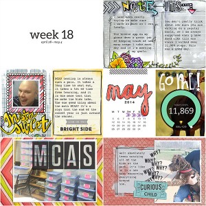
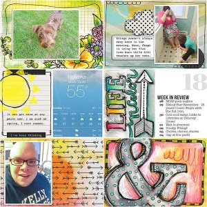
When I started pocket scrapping 2014, I knew I had to make some changes. Looking at the previous year’s pages, I identified a few areas where I could incorporate some more white space on the layouts. First would be my “Week XX” card. I could also simplify my week in review journaling card, and include a simple calendar card. I did a little shopping, and found the perfect answers to my problem. I currently use these week in review cards and these calendar cards, both by Paislee Press. I liked the simple style of Paislee Press, and felt like it would amp up the white space on my page. I also decided on a week card that was mostly white, with only black type with the week number and dates. Using these three tools brought white space back to my pocket pages. Check them out in a spread.
There are a couple of things to note about how and why I used the white space.
- The white space allows me to really go all out on the other cards. I can make them as colorful and busy as I want without everything competing on the page.
- I usually place the three white space cards in a type of triangle formation. This helps to create a visual triangle, and gives the eye somewhere to rest on each part of the page.
- The white space cards give my pages repetition that is simple and bold. It balances my need to be creative and still have organization and order.
Do you use white space on your pocket pages?
I too try to navigate white space on my PL pages- for the exact reasons you’ve mentioned. Your pages look great- colorful but balanced and pleasing to the eye- thanks for sharing your process!