Hello all my artsy friends! I hope everyone is recovering well from MOC 5. :) I just wanted to pop in today with a quick tip for creating super fast, but “oh so awesome,” beveled alphas. Have you ever had trouble finding the perfect alpha for a page? Maybe the kit you are using didn’t come with a coordinating alpha, or the style just doesn’t fit with the theme of your page. Never fear – there is a super quick and easy way to make a dimensional beveled alpha that will coordinate with any kit (or combination of kits) you want to use.
Take a look at this page to see the style I am talking about:

The title “Manly Dude” looks like it came with the kit doesn’t it? The patterns and colors coordinate perfectly with the other elements on the page. That is because I created it with papers from the kit I was using and then applied a bevel style to it! You can complete this technique by clipping papers to your favorite chunky font, or by using alpha templates (which is what I did on this page).
Steps for Creating a Beveled Alpha
1. Type out your title with a chunky font such as Bebas, or use an alpha template to spell out your title. (I used CU Small Pieced Alpha Templates by Scrapping with Liz on the page above.)
2. Clip papers from your kit to the font or alpha templates. (Ctrl-G or Ctrl-Alt-G in Photoshop/PSE). If the alpha is in multiple pieces (like the one I used), you will need to merge each of the letters into one layer to apply the bevel. If you are just working with a font, you can apply the bevel to the font layer and it will work without merging the clipped paper layer to it.
3. Select the merged alpha, or font, layer in the layers palette and choose “Bevel Emboss” from the Layer Styles pop-up menu (the fx button at the bottom of the layers palette in PS).
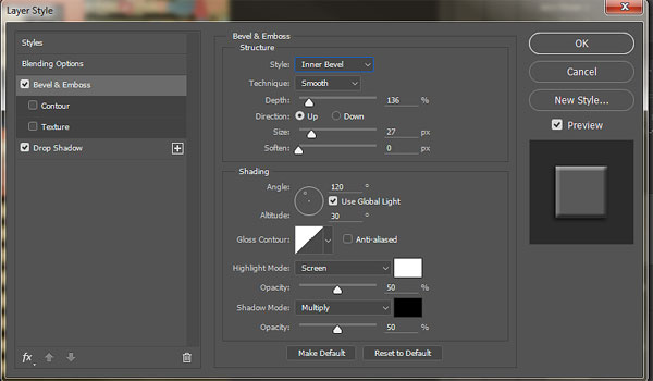
In the Bevel Emboss dialogue box, choose the bevel style, technique and specific settings. On the above alpha, I used the setting noted below (Inner bevel/smooth/Depth: 136/Direction: Up/Size: 27/Soften: 0). The rest of the settings are the default mode. As you can see from the screen shot above, I also added a slight drop shadow to the finished title.
Play with each of the settings until you achieve the look you want. Here are examples of the three different technique settings with the same alpha:
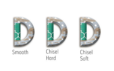
The first example is the one I used on the page (with the settings noted above). The only thing I changed for the second and third examples was the Technique setting.
And that is it! I told you it was super quick. :)
Until next time ~
Judie

Leave a Reply